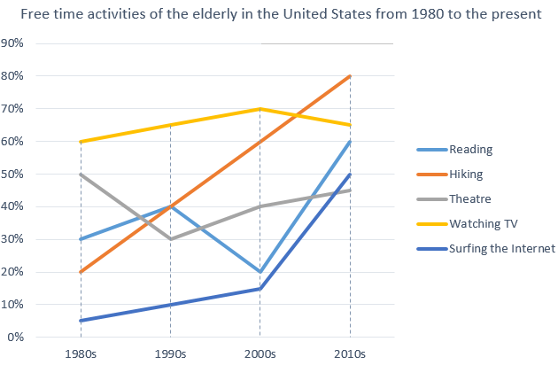
The Table Below Shows the Top Ten Countries with The Largest Population in 2019
The table below shows the top ten countries with the largest population in 2019, and how it is projected to change by 2100. Summarise the information by selecting and reporting the main features, and make comparisons where relevant. The given tabular chart depicts information about the top 10 nations according to their higher folks count […]
The Table Below Shows the Top Ten Countries with The Largest Population in 2019 Read More »