ACADEMIC WRITING TASK 1

The Graph Shows Information of Smoking Frequently Seen Among Athletes

The Graph Shows Information of Smoking Frequently Seen Among Athletes (1)

The Graph shows the information on smoking frequently seen among athletes of Parkview secondary school. Summarize the information by selecting and reporting the main features, and make comparisons where relevant. You should write at least 150 words. The yielded two pie charts demonstrate 15 years old athletes smoking habits frequently at the Parkview secondary school. […]

The Graph Shows Information of Smoking Frequently Seen Among Athletes Read More »

The Percentage of Businesses in The UK that Had a Social Media

The Percentage of Businesses in The UK that Had a Social Media

The bar chart illustrates the percentage of businesses in the UK that had a social media presence from 2012 to 2016. Summarise the information by selecting and reporting the main features, and make comparisons where relevant. Sample Answer of The Percentage of Businesses in The UK that Had a Social Media The yielded bar charts

The Percentage of Businesses in The UK that Had a Social Media Read More »

Information About Five Types of Vehicles Registered in Australia

Information About Five Types of Vehicles Registered in Australia

The table gives information about five types of vehicles registered in Australia in 2010, 2012 and 2014. Summarise the information by selecting and reporting the main features, and make comparisons where relevant. The yielded table illustrates the number and percentage of change of five different transportation modes in Australia in 2010, 212 and 2014. Overall,

Information About Five Types of Vehicles Registered in Australia Read More »

How Rainwater Is Collected for The Use of Drinking Water in An Australian Town

How Rainwater Is Collected for The Use of Drinking Water in An Australian Town

The Diagram shows how rainwater is collected for the use of drinking water in an Australian town. Summarise the information by selecting and reporting the main features, and make comparisons where relevant. The yielded diagram illustrates the use of rainwater as a drink that collects during rain in an Australian town. Overall, it can be

How Rainwater Is Collected for The Use of Drinking Water in An Australian Town Read More »

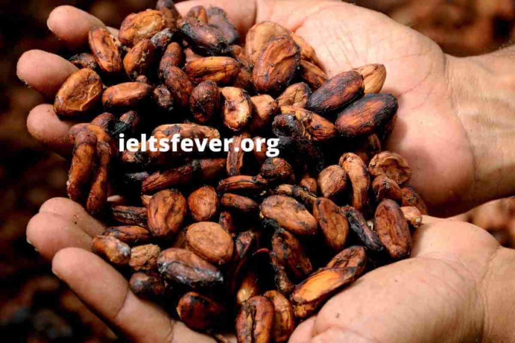
The Diagram Below Shows The Steps of Processing Cocoa Beans

The Diagram Below Shows The Steps of Processing Cocoa Beans

The diagram below shows the steps of processing cocoa beans. Summarise the information by selecting and reporting the main features, and make comparisons where relevant. Sample Answer of The Diagram Below Shows The Steps of Processing Cocoa Beans The yielded diagram demonstrates the processing of cocoa beans. Overall, it can be clearly seen that this

The Diagram Below Shows The Steps of Processing Cocoa Beans Read More »

The Pollution Levels in London Between 1600 and 2000

The graph below shows the pollution levels in London between 1600 and 2000

The graph below shows the pollution levels in London between 1600 and 2000. Summarise the information by selecting and reporting the main features, and make comparisons where relevant. The yielded line charts illustrate the level of pollution, sulphur dioxide and smoke in London from 1600 to 2000, and it measured micrograms per cubic metre. Overall,

The Pollution Levels in London Between 1600 and 2000 Read More »

Scroll to Top