The Graph Below Shows the Number of Hours per Day

The Graph Below Shows the Number of Hours per Day

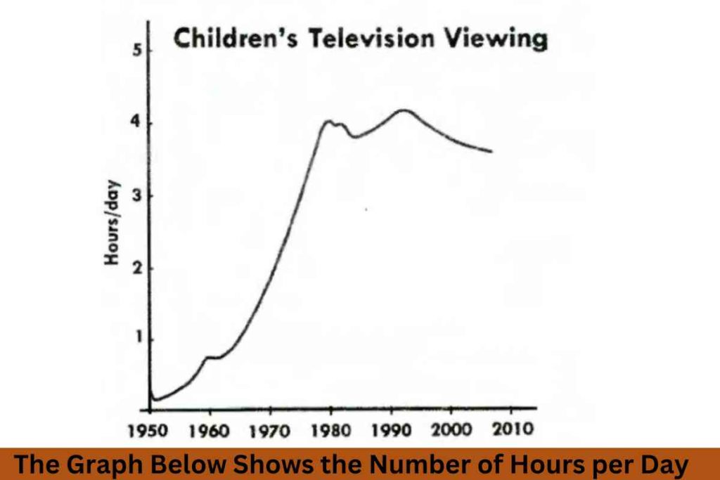
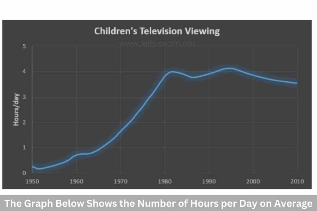
The Graph below shows the number of hours per day on average, that children spent watching television.  Summarise the information by selecting and reporting the main features and make comparisons where relevant. Sample Answer:-The Graph Below Shows the Number of Hours per Day The graph illustrates the average number of hours children spent watching television […]

The Graph Below Shows the Number of Hours per Day Read More »

The Graph Below Shows the Percentage of Azerbaijan’s Export

The Graph Below Shows the Percentage of Azerbaijan’s Export

The graph below shows the percentage of Azerbaijan’s export to four countries from 1990 to 2012. Summarise the information by selecting and reporting the main features and make comparisons where relevant. Sample 1:-The Graph Below Shows the Percentage of Azerbaijan’s Export The chart illustrates the percentages of Azerbaijan’s exports to Japan, the US, China, and

The Graph Below Shows the Percentage of Azerbaijan’s Export Read More »

The Bar Chart Illustrates the Percentage of Businesses in Spain

The Bar Chart Illustrates the Percentage of Businesses in Spain

The bar chart illustrates the percentage of businesses in Spain that had a social media presence from 2012 to 2016. Summarise the information by selecting and reporting the main features and make comparisons where relevant. Sample 1:-The Bar Chart Illustrates the Percentage of Businesses in Spain The bar chart shows data on the percentages of

The Bar Chart Illustrates the Percentage of Businesses in Spain Read More »

Concentrate: IELTS Speaking Part 1 Latest Questions With Answers

Concentrate

Concentrate IELTS Speaking Part 1 Latest Questions With Answers. These are the IELTS Speaking Part 1 Topics and Questions on general topics about your life. Your answers will be from your life and experience. Concentrate: IELTS Speaking Part 1 Latest Questions With Answers Question 1:- Can you concentrate for a long time? Answer:-Yes, I consider

Concentrate: IELTS Speaking Part 1 Latest Questions With Answers Read More »

The Pie Charts Show the Percentage of Pollutants Entering

The Pie Charts Show the Percentage of Pollutants Entering

 The pie charts show the percentage of pollutants entering a specific part of the ocean in 1997 and 2007. Summarise the information by selecting and reporting the main features, and make comparisons where relevant. Sample 1:-The Pie Charts Show the Percentage of Pollutants Entering The two pie charts compare the proportion of domestic sewage, offshore

The Pie Charts Show the Percentage of Pollutants Entering Read More »

Home/Accommodation: IELTS Speaking Part 1 Latest Questions With Answers

Home/Accommodation

Home/Accommodation: IELTS Speaking Part 1 Latest Questions With Answers. These are the IELTS Speaking Part 1 Topics and Questions on general topics about your life. Your answers will be from your life and experience. Home/Accommodation: IELTS Speaking Part 1 Latest Questions With Answers Question 1:- What kind of housing/accommodation do you live in? Answer:-I currently

Home/Accommodation: IELTS Speaking Part 1 Latest Questions With Answers Read More »

The Table Chart Illustrates the Milk Production in A Year

The Table Chart Illustrates the Milk Production in A Year

The table chart illustrates the milk production in a year in four countries (Armenia, Norway, Italy, and German) in 1980, 2000, and 2020. Summarise the information by selecting and reporting the main features, and make comparisons where relevant. Sample 1:-The Table Chart Illustrates the Milk Production in A Year The table charts compare the production

The Table Chart Illustrates the Milk Production in A Year Read More »

Movies & Music: IELTS Speaking Part 1 Latest Questions With Answers

Movies & Music

Movies & Music: IELTS Speaking Part 1 Latest Questions With Answers. These are the IELTS Speaking Part 1 Topics and Questions on general topics about your life. Your answers will be from your life and experience. Movies & Music: IELTS Speaking Part 1 Latest Questions With Answers Question 1:- How often do you go to

Movies & Music: IELTS Speaking Part 1 Latest Questions With Answers Read More »

The Graph Below Shows the Number of Hours per Day on Average

The Graph Below Shows the Number of Hours per Day on Average

The graph below shows the number of hours per day on average that children spent watching television between 1950 and 2010. Summarise the information by selecting and reporting the main features, and make comparisons where relevant.   Sample Answer:-The Graph Below Shows the Number of Hours per Day on Average The provided line graph presents the

The Graph Below Shows the Number of Hours per Day on Average Read More »

The Movement of People from Villages to Cities for Work

The Movement of People from Villages to Cities for Work

The movement of people from villages to cities for work can cause serious problems in both places. What are the serious problems associated with this? What measures can be taken to solve these problems? Sample Answer:-The Movement of People from Villages to Cities for Work It is true that individuals are moving from rural to

The Movement of People from Villages to Cities for Work Read More »

Daily Routines: IELTS Speaking Part 1 Latest Questions With Answers

Daily Routines

Daily Routines: IELTS Speaking Part 1 Latest Questions With Answers. These are the IELTS Speaking Part 1 Topics and Questions on general topics about your life. Your answers will be from your life and experience. Daily Routines: IELTS Speaking Part 1 Latest Questions With Answers Question 1:- What do you normally do in the morning?

Daily Routines: IELTS Speaking Part 1 Latest Questions With Answers Read More »

The Chart Below Shows the Number of Incidents and Injuries

The Chart Below Shows the Number of Incidents and Injuries

The chart below shows the number of incidents and injuries per 100 million passenger miles traveled (PMT) by transportation type in 2002. Summarise the information by selecting and reporting the main features and make comparisons where relevant. Sample 1:-The Chart Below Shows the Number of Incidents and Injuries The given bar chart depicts how many

The Chart Below Shows the Number of Incidents and Injuries Read More »

Scroll to Top