AC WRITING TASK 1

The Illustrations Show How Chocolate is Produced. Ac Writing Task 1

The Illustrations Show How Chocolate is Produced. Ac Writing Task 1 (1)

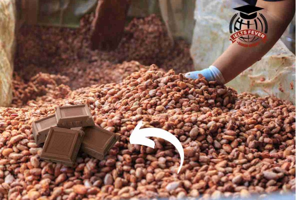
The illustrations show how chocolate is produced. The chart illustrates the manufacturing of chocolates. Overall, it is immediately apparent from the chart that there are a total of 10 stages to producing chocolates, beginning with the ripe pods collected from cocoa trees and culminating in liquid chocolate produced. In detail, ripe red pods have been […]

The Illustrations Show How Chocolate is Produced. Ac Writing Task 1 Read More »

The Line Graph Shows the Average Temperature During the Hottest Part: AC Writing Task 1

The Line Graph Shows the Average Temperature During the Hottest Part AC Writing Task 1

The line graph shows the average temperature during the hottest part of the day in Australia in 2007. The chart illustrates the standard inversion of Australia’s warmest part of the day over one year. Overall, it is immediately apparent from the chart that the average peak temperature was captured in Darwin in summer, while Sydney and

The Line Graph Shows the Average Temperature During the Hottest Part: AC Writing Task 1 Read More »

The Table Shows the Percentage of People with Mobile Phones: AC Writing Task 1

The Table Shows the Percentage of People with Mobile Phones AC Writing Task 1 (1)

The table shows the percentage of people with mobile phones who use various features on their phones. The bar chart illustrates the proportion of mobile users who utilize the various characters of their electronic gadgets. Overall, it is immediately apparent from the chart that the feature of making calls was immensely used by the people

The Table Shows the Percentage of People with Mobile Phones: AC Writing Task 1 Read More »

The graph below shows the information on employment

The graph below shows the information on employment

The graph below shows the information on employment rates across 6 countries in 1995 and 2005. Summarise the information by selecting and report in the main features, and make comparisons where relevant. Sample Answer of The graph below shows the information on employment Sample 1 The bar graph illustrates the proportion of employed individuals in Australia, Switzerland,

The graph below shows the information on employment Read More »

The Line Graph Shows Visits to And from The UK

The Line Graph Shows Visits to And from The UK

The line graph shows visits to and from the UK from 1979 to 1999, and the bar graph shows the most popular countries visited by UK residents in 1999. Summarise the information by selecting and report in the main features, and make comparisons where relevant. Write at least 150 words Answer of the Writing Task The line graph shows

The Line Graph Shows Visits to And from The UK Read More »

The chart below shows the number of men and women in

The chart below shows the number of men and women in further education in Britain in three periods and whether they were studying full-time or part-time.

The chart below shows the number of men and women in further education in Britain in three periods and whether they were studying full-time or part-time. Summarise the information by selecting and report in the main features, and make comparisons where relevant. Write at least 150 words sample answer: INTRODUCTION: The bar chart represents the

The chart below shows the number of men and women in Read More »

Scroll to Top