The Pie Charts Show the Percentage of Pollutants Entering
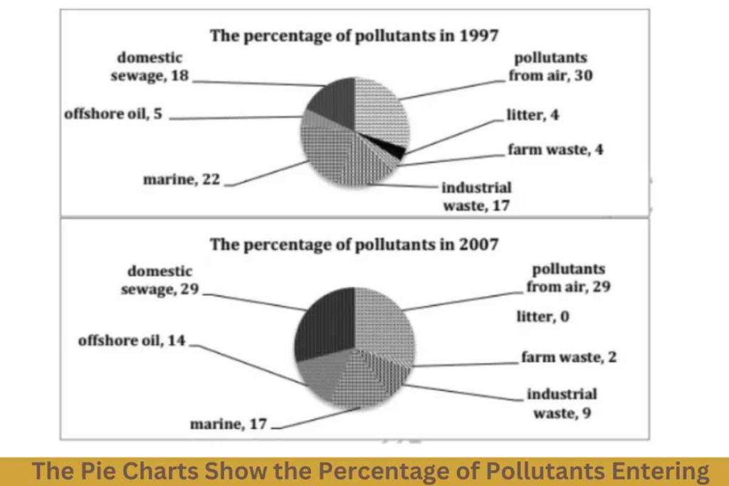
The pie charts show the percentage of pollutants entering a specific part of the ocean in 1997 and 2007. Summarise the information by selecting and reporting the main features, and make comparisons where relevant. Sample 1:-The Pie Charts Show the Percentage of Pollutants Entering The two pie charts compare the proportion of domestic sewage, offshore […]
The Pie Charts Show the Percentage of Pollutants Entering Read More »