The bar chart below gives information about the percentage of the population living in urban areas in different parts of the world. Summarise the information by selecting and reporting the main features, and make comparisons where relevant.
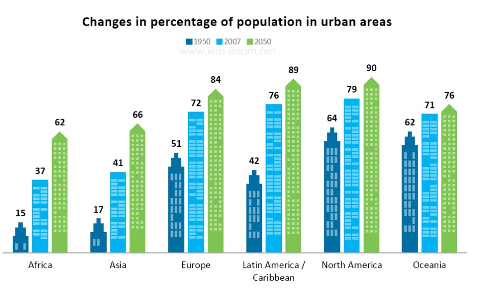
The above bar chart displays the details about urbanization in different regions of the world and is measured in percentage. The information is represented in 3 different years 1950, 2007, and future estimation of the year 2050.
If we compare the phase between 1950 & 2007, the population of Latin America almost doubled from 43% to 76%, and for Africa, the percentage is increased almost 2.5 times from 15% to 37%. for Asia, the increase was also more than twice ranging from 17% to 41% Population growth was less than 50% for continents like Europe, North America and Oceania which stands at 72%, 79%, and 71% respectively.
Now if we talk about future projections, North America accounts for the most number of population which is to be 90% in 2050 which is followed by Latin America and Europe which is around 89& 84% respectively. The least population expected in 2050 is Arica to have 62% of the urban population.
Follow Us on IELTSFever Instagram for more updates and the latest test tasks.
Also Read The Bar Charts Below Provide Information About Percentages of Students
Nice