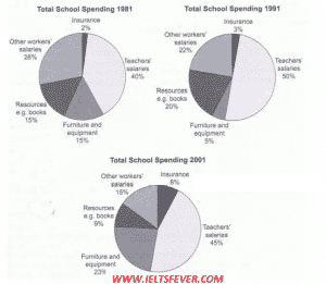
The three pie charts below show the changes in annual spending by a particular UK school in 1981, 1991 and 2001.
The given three pie charts compare the expenditures of an academy of the United Kingdom in the given time period 1981, 991, and 2001.
To begin, in the year 1981, the teachers’ salaries were only 40% but then, there were increased by more 10% in 1991. The furniture and equipment expenditures were 15% in 181 which were declined in the following ten years by on in ten. From1981 to 1991, resources were up to 15% and 20% respectively. The insurance was around just a small minority and there was a difference of 6% in other workers’ annual incomes till following ten years from 1981.
In 2001, the two sectors resources, other workers salaries and teachers pay were decreased up to 9 %, 15 %, and 45%accordingly than the last twenty years. On the other hand, the two sectors were climbed in 2001. The insurance was growing up to 8% and the furniture and equipment were in an upward trend with 23%.
Overall, it is immediately apparent from the graph that the teachers’ salaries sector remained at the highest percentage in all the years whereas the insurance sector was placed at the lowest proportion.
Follow us on twitter ieltsfever
the changes in annual spending by a particular UK school


Visitor Rating: 3 Stars