


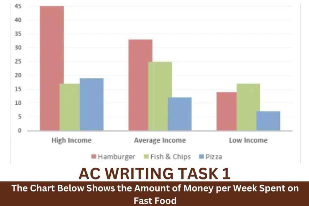


The given bar chart and line graph illustrate information about the money spent by the three different income individuals.Per week on convenience food in the UK in 1990 and how much food was consumed in grams over a twenty-year period, between 1970 and 1990.
Overall, the bar chart and line graph reveal that Hamburgers were popular among the UK population. And consumption of hamburgers increased year by year.
In the bar chart, high-income people spent exactly 45 pence per person on hamburgers. While only about 18 and 16 pence per person were spent on pizza and fish and chips. Thirty-three percent were spent on hamburgers, whereas exactly 25 pence and approximately 13 pence were spent on pizza and fish and chips . Low-income individuals spent less on every item that was on hamburgers—around 13 pennies, 17 pence on fish and chips, and 7 pence on pizza.
As for the line graph, it shows that consumption of hamburgers increased significantly from 90 grams to 500 grams between 1970 and 1990. In 1970, pizza consumption was the lowest (40 grams), but it rose rapidly to 300 grams in 1990. Fish and chip consumption was the highest (300 grams) in 1970; however, it declined steadily to approximately 200 grams in 1990.
![]()

Sample 2:-The Chart Below Shows the Amount of Money per Week Spent on Fast Food
The given bar graphs depict the standard notion of trends followed by various income communities. In line with their habits of purchasing fast foods in the region of the United Kingdom. The later graph reveals the figures for a period of 20 years in the same aspect.
Overall, the consumption of fast food has soared to new heights in recent decades albeit the descent of healthy eateries. The economically elite community indulges in the highest consumption of junk food compared to the marginal and low-income groups.
From the first graph, it is obvious that an individual from a higher income enjoys a harm burger of 40 pence per week A nd fish, along with pizza, is marginal to 15 pence. But for the average earning person in a week He depends on fast food as on 30 pence of hamburger and fish. And chips to 10 percent less and the least is pizza marking ten lastly fish and chips are consumed more by the low-income and hamburgers are accounted the least compared to the other two elite groups.
In the later graph it’s observed that fish and chips were popular in 1970. Ranking 300 grams which eventually dropped to 200 in 1980 and continued until 1990. Whereas, the fast-food hamburgers and chips were merely less than 100 in 1970. But in 1980 hamburgers soared to all-time high 300 grams in 1980 .In1990 reaching almost 500 .But fish and chips soared in 1985 .