The Charts Below Give Information About World Spending and Population. Summarise the Information by Selecting and Reporting the Main Features, and Make Comparisons Where Relevant.
Sample 1: The Charts Below Give Information About World Spending and Population
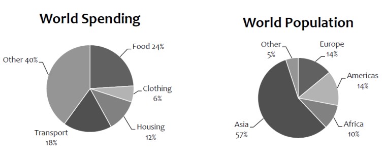
The two pie charts represent information about world spending and world population.
Overall, even though numerous fluctuations can be seen in the given pie chart, except in others and Asia, the percentage was higher than in other sections.
Having a fleeting glance, the information given involved spending pie charts. The percentage of food in the food section was 24%. However, a dramatic decrease of 6% was observed, and almost a 6% difference was seen in both the housing and transport sections, which were 12% and 18%, respectively. A sudden increase of 40% was observed.
Moving to the given information, the world population of Europe and America was almost the same, 14% and a 5% difference was seen between Africa and other countries. There was a dramatic increase for Asia, which was 57%.
Follow Us On IELTSFever Facebook Page For More Updates
Sample 2: The Charts Below Give Information About World Spending and Population
The pie charts compare the shares of five major items in global expenditures and show the distribution of the worldwide population. The data has been calibrated in percentage.
At first glance, the primary chart clearly shows that the most significant amounts are paid for food, which accounts for almost a quarter of the world’s spending. Besides this, the percentile of attire is minimum, followed by housing and transport, which is one-twenty. Further, 40% of the amount is used for other items.
Further, according to the secondary pie chart, the proportion of Europeans and Americans is stagnant. Moreover, 10% of the world’s inhabitants belong to Africa, which is double the other world population, and Asia recorded 57% of the total population.
Overall, the largest percentage of the world’s income is spent on food in the first pie chart, whereas Asia has the highest percentage of the population in the second pie chart.
Pages Content
Discover more from IELTS Fever
Subscribe to get the latest posts sent to your email.