


The Charts Give Information About Employment in The Uk in 1998 and 2012. Summarise the Information by Selecting and Reporting the Main Features, and Make Comparisons Where Relevant.
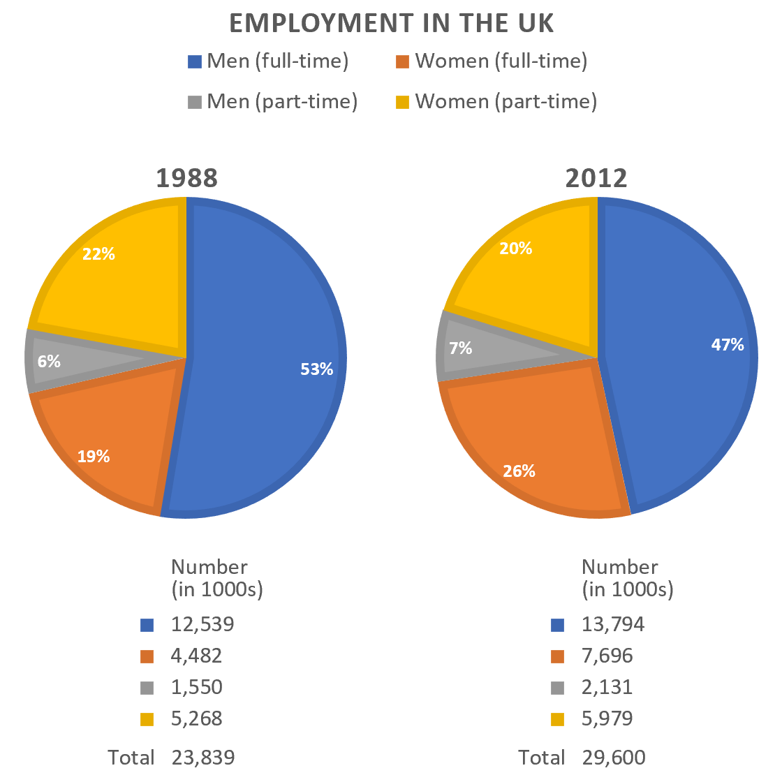
The pie charts provides the informations about men and women working on full time and part time employment in the United Kingdom between 1998 and 2012.
Overall, there was a considerable high percentage of males working on full time jobs compared to the females throughout the time period. However it has shown clearly from the chart that women attracted more on part time employment.
Women dominated part time jobs since 1998 to 2012 at just below a quarter 19 % and 26% slightly above the quarter, while they maintained the same relative contribution in full time employment at 22% and 20% respectively.
Full time works seems to be overpopulated by male gender from year 1998 at 54% up to the next fourteen years at 47% . In contrast , Men appeared to dislike part time recruitment with 6 % in 1998 and 5% in 2012.