The graph below presents the employment patterns in the USA between 1930 and 2010. Summarise the information by selecting and report in the main features, and make comparisons where relevant. Write at least 150 words.
Sample Answer of The Employment Patterns in the USA Between 1930 and 2010
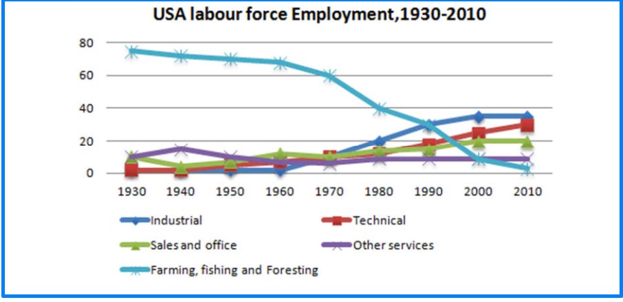
The yielded line charts illustrate four different labor forces, industrial, sales and office, farming, fishing and foresting, technical and other services employment in the USA from 1930 to 2010.
Overall, we can clearly see that farming, fishing, and foresting employment was declined year after year while other rates rose slightly.
For industrial, labor force was not developed in 1930, and after a decade it was roughly 2 which remained till 1960. Later it rose dramatically to 30 in 2000 and stood the same in 2010. For technical, had same force in 1930 and 1940 as had industrial in 1940 and took a half-century to reach 20 and in 2010 stood as likely same position as industrial had. For farming, fishing and foresting, with the highest employment force through the period was 70 in 1930 that decline slowly to 30 after 40 years. After 1970 it plunged and touched its dip 1 in 2010.
For sales and office and other services, In 1930 both categories employment force was same on account of 10. For the latter one, it was the same after two decades, and between that period, it reached zenith point 18, and in 1960 it had 8 which was the same for the next half-century; however, the former had the opposite force between 1930 to 1970. Which stood up, and in 2010 force was double that starting year.
Follow us on IELTSFever Instagram
Also, Read A Structure That Is Used to Generate Electricity From Wave Power