


The graph below shows the average monthly change in the prices of three metals during 2014. Summarise the information by selecting and reporting the main features and make comparisons where relevant.
Sample Answer: The Graph Below Shows the Average Monthly Change in The Prices of Three Metals During 2014
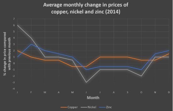
The line graph compares the average monthly change in the prices of copper, nickel and Zinc in 2014.
Overall, nickel was in high demand at the beginning of the year, but lost its value at the end of the year. In contrast, Zinc was the cheapest item, but it turned out to be the most expensive among all metals as time went on. Copper experienced a relatively similar price trend to the others.
There was a significant change in the price of nickel in January at 6 per cent, while the trend dropped dramatically to one per cent in the next three months, although it passed through an erratic period.
Finally, in December, it popped up to approximately the same level as it was in March. Unlike Zinc, which started at the bottom of the graph at one per cent before experiencing a significant change in February to three per cent, despite the fluctuating season, in December it overtook the rest of the metals. It became the most popular at two per cent.
On the other hand, copper remained relatively stable to Exact average change in the price over the year, with two per cent and just below two per cent in January and December, respectively.