The graph below shows the information on employment rates across 6 countries in 1995 and 2005.
Summarise the information by selecting and report in the main features, and make comparisons where relevant.
Sample Answer of The graph below shows the information on employment
Sample 1
Sample 2
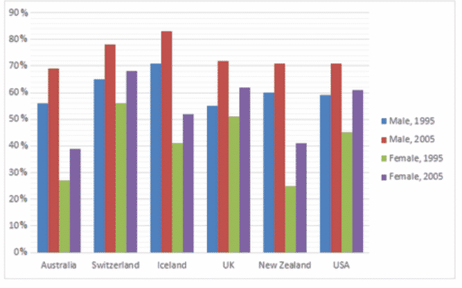
The rendered vertical bar graph manifests the information regarding the proportion of employed individuals in six nations namely, Australia, Switzerland, New Zealand, Iceland, Britain, and the USA, about one decade from 1995 to 2005. The data has been calibrated in percentage.
Overall, the striking feature is that the men had a better employment record as compared to the women throughout the given tenure. Moreover, Iceland and Switzerland’s employment conditions were comparatively better than the rest of the nations.
As is presented in the given bar graph, in Australia, more than half of the male was employed, in 1995, whereas its ratio was drastically increased in the next ten years. By 70%, Switzerland and Iceland’s men possessed jobs in 1995, but it gradually grew and Iceland’s men status reached at zenith point around 80% by 2005.
The percentile of employment rates in the UK, New Zealand, and the USA was more or less similar in the initial year, about 60%. However, after a decade, a significant proportion was observed in these three nations regarding the businessmen, was just below three quarter.
Further analysis regarding the females reveals that, in 1995, a quarter of women were employed for the job, in Australia. Whereas merely one-tenth of females were inclined in the next ten years. The females’ employment ratio was only 55% in 1995, while it reached 70% in 2005, in Switzerland. The percentage of working women in Iceland was just over 40%, in 1995. On the other hand, its ratio was escalated and reached exactly half.
The proportion of employed women in New Zealand and America rose slightly from 47% in 1995 and after a decade it consisted of 60%. In the UK, the percentile of working females was more than half whereas in the subsequent years its ratio increased only one-tenth.
So these are the sample answer of ( The graph below shows the information on employment rates across 6 countries in 1995 and 2005.)
Pages Content