The graph shows the percentage of the population living in urban areas on different continents. Summarise the information by selecting and reporting the main features, and make comparisons where relevant.
Sample Answer of The Graph Shows the Percentage of the Population Living in Urban Areas
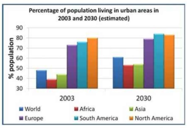
The provided bar charts reveal six different continents, Europe, Africa, South America, the world, Asia and North America’s percentage urban areal population in 2003 and forecast for 2030.
Overall, Europe, South America and North America had a major percentage citizen while will increase
slightly in 2030 additionally, another continent popular also rise.
In 2003, the highest percentage four-fifth percentage of North American lived in the city while half of that percentage of African lived, that was also the least proportion that time. World and Asia had approximately 48% and 44% urban areas population respectively.. 8% less than North America percentage citizen lived in Europe and just more 3% European people lived in South America.
In 2030, it predicted that above just tenth percentage will jump up in world and Europe however, Africa and Asia population percentage in the countryside will same on account of half proportion. South America will have a peak percentage of roughly 83% and 82% of North American people will live in the city.
Also, Read
The Pie Charts Below Show the Average Household Expenditures