


The line graph below shows the percentage of tourists to England who visited four different attractions in Brighton. Summarize the information by selecting and reporting the main features and making comparisons where relevant.
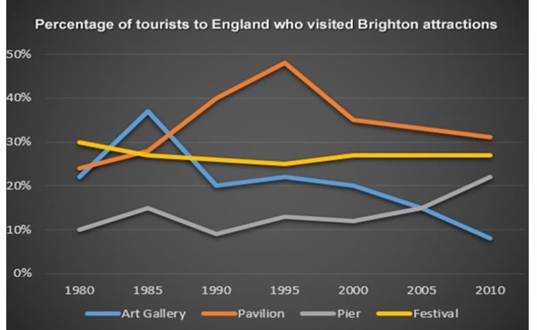

The line graph illustrates the trend of total visitors that went to four distinct places in Bridgton, England between 1980 to 2010.
To outline, art galleries and festivals saw a downward trend, whereas Pavilion and pier experienced an upward trajectory.
Regarding Pavilion, in 1980 the total tourist attraction was over 20% which then rose dramatically to a peak of around 50% in 1995. However, from 1995 the trend experienced a sharp fall to around 35% in 2000 and then gradually declined to 30%. The figure of Pier showed some fluctuations throughout the years. But the general trend was upward, and it ended in 2010 at around 28%.
The percentage of festivals slightly plunged from 30% to around 25% in 2000 and showed a marginal growth to around 29%. From 2000 onwards, the number of travellers to festivals levelled off. Art gallery in 1980 was around 31%, which saw a considerable growth to around 38%, however, declined after gradual fluctuations to around 9%, being the least preferred tourist site in 2010.
Follow Us on IELTSFever Twitter for more updates