The pie chart gives information about the country of birth of people living in Australia, and the table shows where people born in these countries live. Summarize the information by selecting and reporting the main features, and make comparisons where relevant.
Sample Answer of The Pie Chart Gives Information About the Country of Birth of People
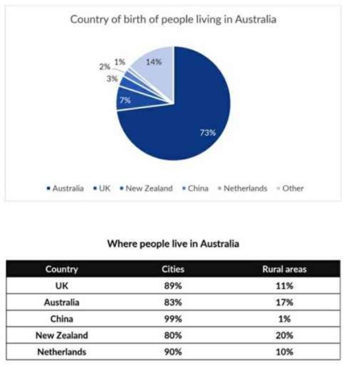
The pie chart illustrates the country of born of people residing in Australia and the table depicts that where people live in a rural area or cities area depending on the birth of these countries. Overall, Australia is the highest leading country. At the same time, the Netherlands is the least country with the birth of people living, and on the other hand, the majority of people preferred to live in cities area than in rural areas.
To begin with, China which is accounted for 2% of the birth people in that 99% of the people liked to live in an urban area, and just only 1% lived in rural areas. Whereas, Netherland with just 1% of people’s birth in which 90% of people resides in Cities and only 10% lived in rural areas.
In New Zealand, 80% of people live in urban areas, which is the lowest compared to other countries, while 20% of people live in village areas, the highest number of people living with respect to other countries. In Australia, 73% of births of people living in Australia in which 83% live in Cities while 17% live in rural areas.