The Pie Charts Below Show Units of Electricity Production by Fuel Source in Australia and France in 1980 and 2000. Write a Report for A University Lecturer Describing the Information Shown Below, and Make Comparisons Where Relevant.
 Sample Answer: The Pie Charts Below Show Units of Electricity Production by Fuel Source in Australia and France in 1980 and 2000
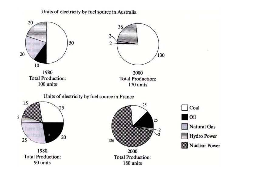
📊 The four pie charts illustrate the number of units of electricity generated from different fuel sources in Australia and France in the years 1980 and 2000.
🔍 Overall, in Australia, coal was the dominant source of electricity in both years. In contrast, in France, natural gas was the primary source in 1980, while nuclear power became the most significant by 2000.
⚡ In Australia, electricity generated from coal comprised 50 units in 1980, which showed a dramatic increase of 80 units, reaching 130 units in 2000. 🇫🇷 On the contrary, France generated only 25 units of coal in both years, showing no change.
☢️ Nuclear power in France experienced a massive rise, becoming the most significant contributor in 2000. It rose from just 15 units in 1980 to 126 units in 2000, marking a substantial shift in energy reliance.
🔥 In Australia, natural gas contributed 20 units in 1980, but its usage sharply declined to only two units in 2000. Similarly, in France, electricity generated from natural gas also plummeted from 25 units to 2 units over the same period.
💧 Hydropower in Australia produced 20 units in 1980 and increased to 36 units by 2000. Meanwhile, France generated five units of electricity from hydropower in 1980, decreasing to two units in 2000.
🛢️ Regarding oil, Australia reduced its usage from 10 units to 2 units, whereas France slightly increased its dependence, rising from 20 units in 1980 to 25 units in 2000.