The pie charts show the average consumption of food in the world in 2008 compared to China and India. Write a report to a university lecturer describing the data.
Write at least 150 words
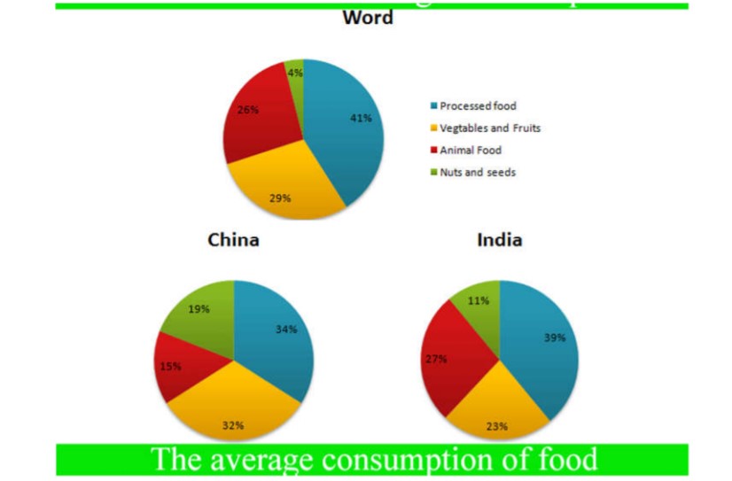
Sample Answer of The Pie Charts Show the Average Consumption of Food in the World
The given pie charts depict information about the utilisation of food by the population of the world in 2008 and also show a comparison of food consumption among two different nations in the same year.
Overall, it is conspicuous that a large amount of processed food was consumed by the world’s population compared to India and China. However, more in both these nations in a given period, nuts and seeds are eaten by more in both these nations.
First, utilisation of animal food was essentially worldwide (27%) and in India(26%). At the same time, China accounted for less than 20 per cent. The percentage of the average consumption of raw material like vegetables and fruits was almost third in China. On the other hand, these raw materials only contribute 23% of the total diet of Indians and 29 % of the world’s population.
People in this world are 41% processed food that was highest consumed food in 2008 compared to both the given nations. India used 39%. Processed food whereas Chinese people ate 5% less than India. Besides this, nuts and seeds ate by the world was just 4% (lowest among all the types) on the other hand, Indians ate almost 11 percent, but chineses consumed 19 %…