


The table and pie chart illustrates populations in Australia according to different nationalities and areas. Summarize the information by selecting and reporting the main features and make comparisons where relevant.
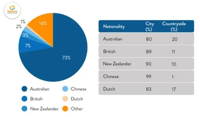

The given pie chart shows the percentage of people of different nationalities residing in Australia, while the table shows demographic figures which are classified according to urban and rural areas.
Overall, Australians are the largest nationalities, residents, almost three-quarters of the major population, and they tend to live in the urban area. This figure is followed distantly by other citizens who are almost twice the residents from Great Britain (7%), New Zealanders at 3%, Chinese at 2%, and people from the Netherlands at just 1%.
It is readily apparent that Chinese live predominantly in the cities up to 99%, whereas only 1% live in the countryside. The other vast majority of city dwellers is New Zealanders and British, which display nearly identical proportions around 90%. In terms of living areas, Australians are few likely to live outside the cities, nearly 20%, while the rest still live in urban environments. Similarly, 83% of the Dutch live in cities and 17% in the countryside.
Follow Us on IELTSFever Twitter for more updates