The table below shows the results of surveys in 2000, 2005 and 2010 about one university. Summarise the information by selecting and reporting the main features, and make comparisons where relevant.
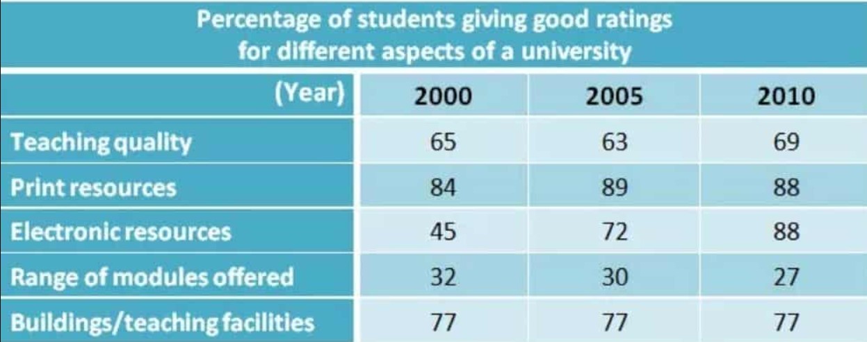
The Spreadsheet vividly portraits the review of surveys about good ratings in different aspects of a prominent university between three distinct years, 2000, 2005 and 2010. Units are measured in percentage.
Overall, the most outstanding features are that the department of print resources, building/teaching facilities and teaching quantity was rated as the best performances in all three years whilst electronic resources and range of modules offered was rated as average.
The Significant features will be discussed in the following paragraphs.
As is presented in the tabular graph, in 2005, the department of print resources scrutiny recorded the highest rating at 89%; in 2010, there was a drop of 1%, and it dipped down to 4% 2010.
Moving further, the percentile of review in the Building /Teaching facilities remained unchanged in all the years whilst Teaching quality was 63% in 2005, rose slightly by 2% in 2000 and hit a peak approximately over the period of time. However, Electronic resources department ratings skyrocket to 88% in 2010, fell drastically in 2005 and went down in 2000 whilst Ranges of modules offered were bare minimum.
Follow Us on IELTSFever Instagram for more updates and the latest test tasks.
Also, Read The Pie Chart Below Shows Energy Is Used in a Typical Australian