ACADEMIC WRITING TASK 1

The Diagram Below Describes the Stages of Making Canned and Bottled Carbonated Drinks

The Diagram Below Describes the Stages of Making Canned and Bottled Carbonated Drinks

The Diagram Below Describes the Stages of Making Canned and Bottled Carbonated Drinks. Summarise the information by selecting and reporting the main features and making comparisons where relevant. Sample Answer: The Diagram Below Describes the Stages of Making Canned and Bottled Carbonated Drinks The diagram provides information on the drink’s making process in a particular […]

The Diagram Below Describes the Stages of Making Canned and Bottled Carbonated Drinks Read More »

The Line Graphs Below Show the Production and Demand for Steel in Million Tonnes

The Line Graphs Below Show the Production and Demand for Steel in Million Tonnes

The Line Graphs Below Show the Production and Demand for Steel in Million Tonnes and The Number of Workers Employed in The Steel Industry in The Uk in 2010. Summarise the Information by Selecting and Reporting the Main Features, and Make Comparisons Where Relevant. Sample Answer: The Line Graphs Below Show the Production and Demand for

The Line Graphs Below Show the Production and Demand for Steel in Million Tonnes Read More »

The Graph Below Shows the Number of Overseas Visitors Who Came to The USA

The Graph Below Shows the Number of Overseas Visitors Who Came to The USA

The Graph Below Shows the Number of Overseas Visitors Who Came to The USA for Different Purposes Between 1989 and 2009. Summarise the Information by Selecting and Reporting the Main Features, and Make Comparisons Where Relevant. Sample Answer: The Graph Below Shows the Number of Overseas Visitors Who Came to The USA The line graph

The Graph Below Shows the Number of Overseas Visitors Who Came to The USA Read More »

The Table Below Gives Information About the Salaries of Secondary/high School Teachers in Five Countries in 2009

The Table Below Gives Information About the Salaries of Secondary/high School Teachers in Five Countries in 2009.

The Table Below Gives Information About the Salaries of Secondary/high School Teachers in Five Countries in 2009. Summarise the Information by Selecting and Reporting the Main Features and Make Comparisons Where Relevant. Sample Answer: The Table Below Gives Information About the Salaries of Secondary/high School Teachers in Five Countries in 2009. The table illustrates data

The Table Below Gives Information About the Salaries of Secondary/high School Teachers in Five Countries in 2009 Read More »

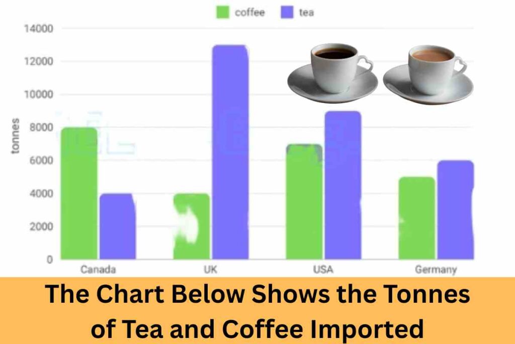
The Chart Below Shows the Tonnes of Tea and Coffee Imported

The Chart Below Shows the Tonnes of Tea and Coffee Imported

The Chart Below Shows the Tonnes of Tea and Coffee Imported by Canada, the Uk, the Usa, and Germany in 2007. Summarise the Information by Selecting and Reporting the Main Features, and Make Comparisons Where Relevant. Sample Answer: The Chart Below Shows the Tonnes of Tea and Coffee Imported by Canada, the UK, the USA,

The Chart Below Shows the Tonnes of Tea and Coffee Imported Read More »

The Chart Below Shows the Proportion of Businesses

The Chart Below Shows the Proportion of Businesses Making E-Commerce Purchases by Industry in Canada Between 2015 and 2019.

The Chart Below Shows the Proportion of Businesses Making E-Commerce Purchases by Industry in Canada Between 2015 and 2019. Summarise the Information by Selecting and Reporting the Main Features, and Make Comparisons Where Relevant. Sample Answer of The Chart Below Shows the Proportion of Businesses Making E-Commerce Purchases by Industry in Canada Between 2015 and 2019.

The Chart Below Shows the Proportion of Businesses Read More »

The Diagrams Below Show a Community Centre’s Changes in The Last Ten Years

The Diagrams Below Show a Community Centre’s Changes in The Last Ten Years

The Diagrams Below Show a Community Centre’s Changes in The Last Ten Years. Summarize the Information by Selecting and Reporting the Main Features, and Make Comparisons Where Relevant. Sample Answer: The Diagrams Below Show a Community Centre’s Changes in The Last Ten Years The two diagrams illustrate the changes in a community centre in the

The Diagrams Below Show a Community Centre’s Changes in The Last Ten Years Read More »

The Chart Below Shows the Total Number of Minutes (in Billions) of Telephone Calls in The UK

The Chart Below Shows the Total Number of Minutes (in Billions) of Telephone Calls in The UK

The Chart Below Shows the Total Number of Minutes (in Billions) of Telephone Calls in The Uk, Divided Into Three Categories, from 1995 to 2002. Summarise the Information by Selecting a Reporting of The Main Features and Make Comparisons Where Relevant. Sample Answer: The Chart Below Shows the Total Number of Minutes (in Billions) of

The Chart Below Shows the Total Number of Minutes (in Billions) of Telephone Calls in The UK Read More »

The pie chart and table below give information on tourists visiting Australia

The pie chart and table below give information on tourists visiting Australia

The pie chart and table below give information on tourists visiting Australia. Summarise the information by selecting and reporting the main features, and make comparisons where relevant. Sample Answer: The pie chart and table below give information on tourists visiting Australia The Statistics provided in the form of pie diagrams and tabulations suggest insight into globetrotters

The pie chart and table below give information on tourists visiting Australia Read More »

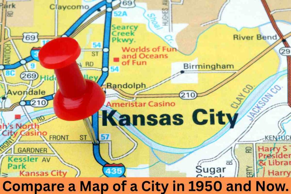
Compare a Map of a City in 1950 and Now. AC Writing Task 1

Compare a Map of a City in 1950 and Now. AC Writing Task 1

Compare a Map of a City in 1950 and Now. Summarise the information by selecting and reporting the main features and make comparisons where relevant. Answer For Compare a Map of a City in 1950 and Now. AC Writing Task 1 The two diagrams illustrate the different features in a given city between the year

Compare a Map of a City in 1950 and Now. AC Writing Task 1 Read More »

The Maps below show the changes that occurred in a town named Willington: AC Writing

The Maps below show the changes that occurred in a town named Willington

The Maps below show the changes that occurred in a town named Willington in 1780,1860 and 2000. Summarise the information by selecting and reporting the main features and make comparisons where relevant. The diagrams give information about Willington’s urban development changes in the years 1780, 1860, and 2000, consecutively. Overall, in the beginning, the town’s

The Maps below show the changes that occurred in a town named Willington: AC Writing Read More »

The Plans Below Show how The Groud Floor of A Particular Building Has Changed Over Time

The Plans Below Show how The Groud Floor of A Particular Building Has Changed Over Time

The Plans Below Show how The Groud Floor of A Particular Building Has Changed Over Time. Summarise the Information by Selecting and Reporting the Main Features and Making Comparisons Where Relevant. The three diagrams demonstrate how a given property’s lowest floor structure has been replaced through the years. ✨ Overall, the kitchen and entrance 🏢

The Plans Below Show how The Groud Floor of A Particular Building Has Changed Over Time Read More »

Scroll to Top