The Graph Below Shows the Number of Overseas Visitors Who Came to The USA for Different Purposes Between 1989 and 2009. Summarise the Information by Selecting and Reporting the Main Features, and Make Comparisons Where Relevant.
 Sample Answer: The Graph Below Shows the Number of Overseas Visitors Who Came to The USA
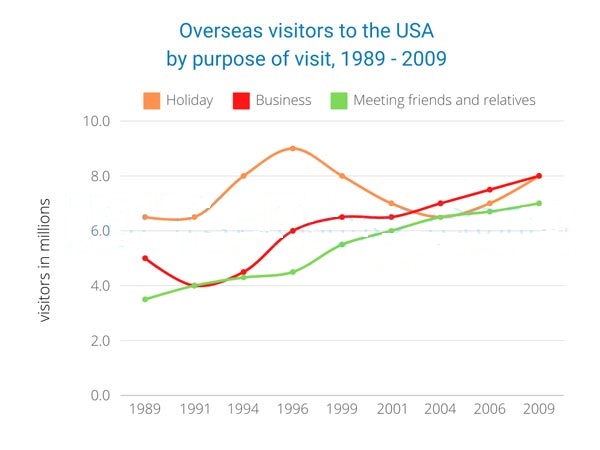
The line graph demonstrates how many foreigners travelled to the United States from 1989 to 2009 for different reasons.
Overall, overseas visitors who went to the USA for business and said hello to friends and relatives rose relatively the same over the period of 20 years. On the other hand, holiday makers initially increased massively and then decreased to the same level as those who went on business and met friends and relatives.
In the first moment of 1989, meeting friends and relatives was the least purposeful, with nearly 3.7 million. Business and meeting friends and relatives had concurrent 4.0 million in 1991 and then increased relatively similarly throughout the period.
However, the holiday was the most popular reason for visiting the USA, with a peak of approximately 9 million in 1996. It then descended until it reached the same point of meeting friends and relatives at around 6.5 million in 2004. Afterwards, it started to ascend to the equal level of those who came with business purposes in 2009.
Follow Us on the IELTSFever Facebook Page for more Updates
Discover more from IELTS Fever
Subscribe to get the latest posts sent to your email.