The Table Below Gives Information on Consumer Spending: Recent AC Test
The table below gives information on consumer spending on different items in five different countries in 2002. Summarise the information by selecting and reporting the main…
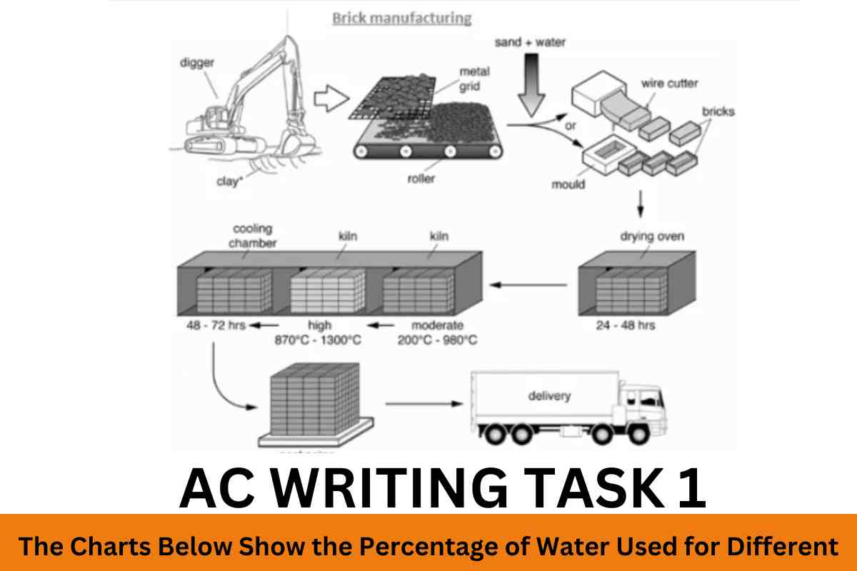
The diagram below shows the process by which bricks are manufactured for the building industry. Summarise the information by selecting and reporting the main features, and…
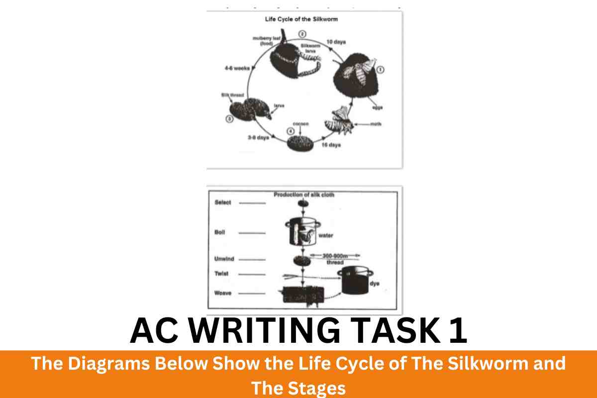
The diagrams below show the life cycle of the silkworm and the stages in the production of silk cloth. Summarise the information by selecting and reporting…
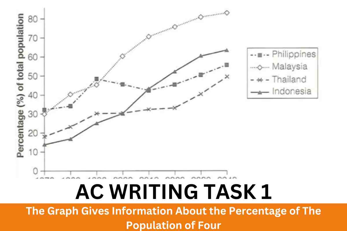
The graph gives information about the percentage of the population of four different Asian countries living in cities between 1970 and 2020, with additional predictions for…
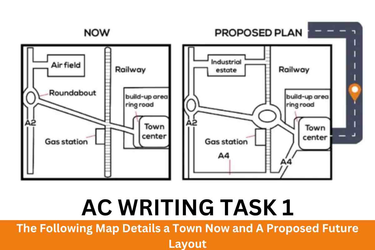
The following map details a town now and a proposed future layout. Summarise the information by selecting and reporting the main features and make comparisons where…
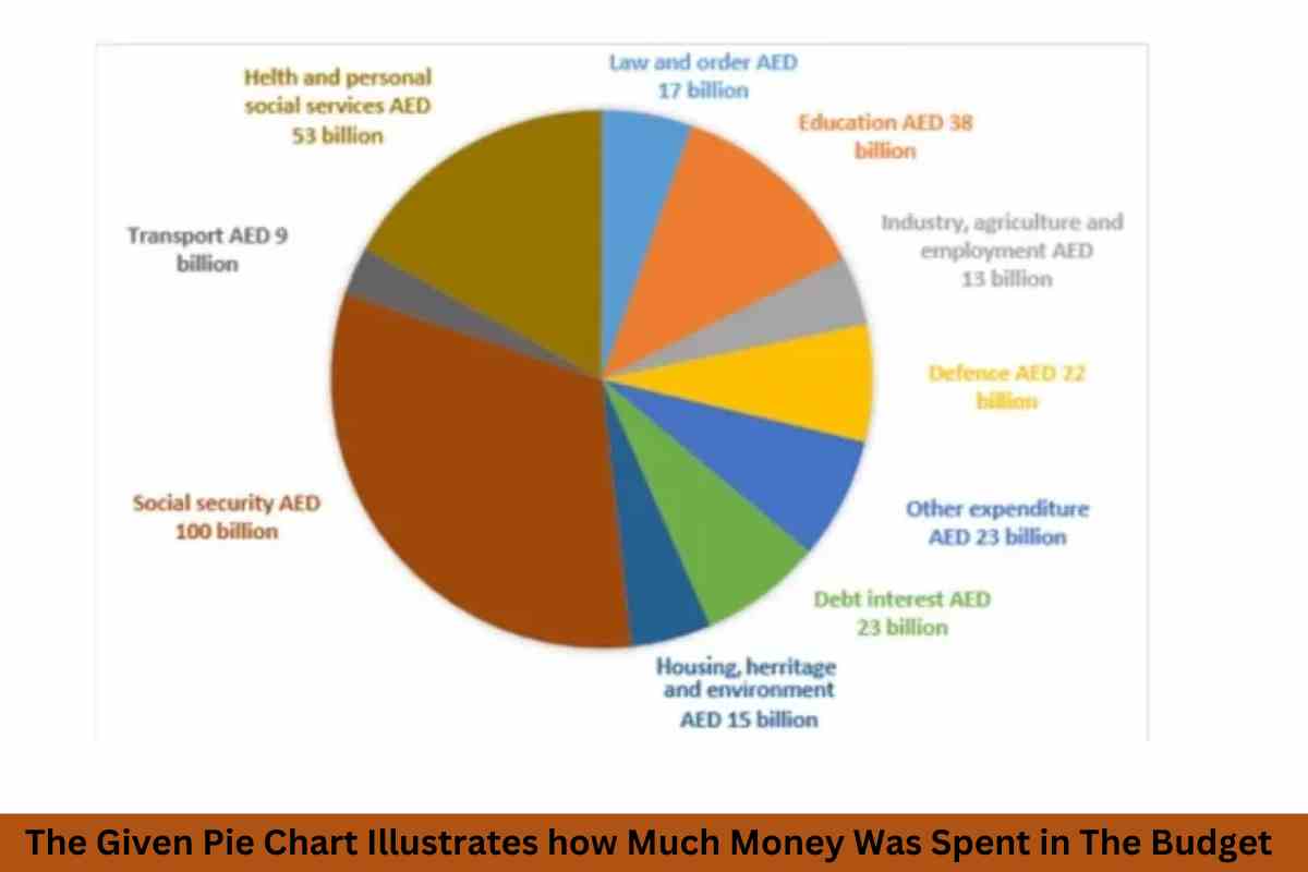
The given pie chart illustrates how much money was spent in the budget on different sectors by the UAE government in 2010. Summarise the information by…
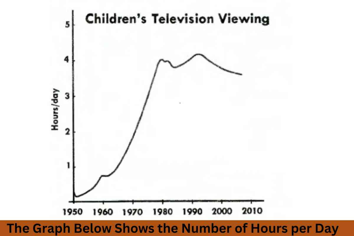
The Graph below shows the number of hours per day on average, that children spent watching television. Summarise the information by selecting and reporting the main…
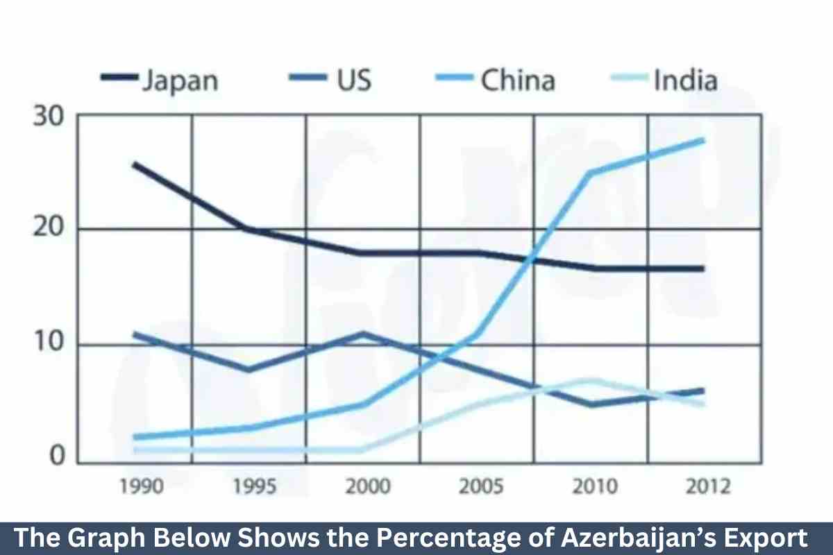
The graph below shows the percentage of Azerbaijan’s export to four countries from 1990 to 2012. Summarise the information by selecting and reporting the main features…
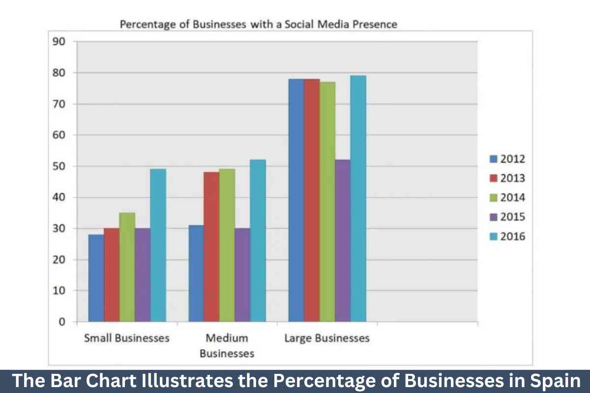
The bar chart illustrates the percentage of businesses in Spain that had a social media presence from 2012 to 2016. Summarise the information by selecting and…
The pie charts show the percentage of pollutants entering a specific part of the ocean in 1997 and 2007. Summarise the information by selecting and reporting…
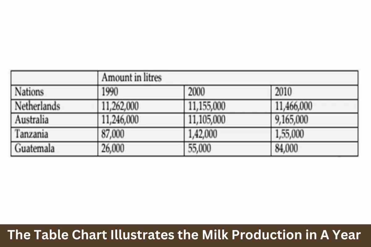
The table chart illustrates the milk production in a year in four countries (Armenia, Norway, Italy, and German) in 1980, 2000, and 2020. Summarise the information…
The graph below shows the number of hours per day on average that children spent watching television between 1950 and 2010. Summarise the information by selecting and…