The chart and graph below give information about sales and share prices for Coca-Cola. Write a report for a university lecturer describing the information shown below.
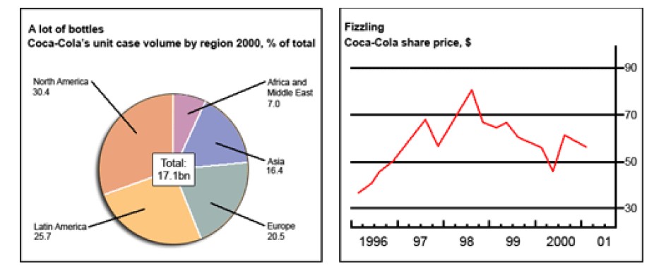
The pie chart depicts the percentage of Coca-Cola’s sales in 5 different markets, while the line graph illustrates the share price over six years, commencing from 1996.
Overall, North America was Coca-Cola’s biggest market in 2000, and this company’s share price fluctuated significantly from 1996 to 2001.
It is evident that North Americans bought a huge volume of Coca-Cola’s products, generating 30.4% amongst all. Subsequently, Latin America was reported to be the second-largest market, with almost a quarter of the total sales. This was followed by 20.5% and 16.4% in Europe and Asia respectively. In contrast, Africa and Middle East countries were not successful markets for Coca-Cola due to its low percentages of sales, only 7 per cent.
Regarding the firm’s share price, it was approximately $40 per share in 1996, hitting its lowest point in 6 years. Two years later, this brand’s trading price on the share market witnessed a significant increase, almost twice at the starting point and reached its peak at $80. After 1998, the share price decreased dramatically until the year 2000 (not more than $50). However, this trend changed and climbed back to nearly $60 per share at the end of the period.
Follow Us on IELTSFever Twitter for more updates
Discover more from IELTS Fever
Subscribe to get the latest posts sent to your email.