


IELTS Academic Writing Task 1: The chart below shows the percentage of young people in higher education in four different countries in 2000, 2005 and 2010. Summarise the information by selecting and reporting the main features and make comparisons where relevant.

Sample Answer of IELTS Academic Writing Task 1: The Chart Below Shows the Percentage of Young People in Higher Education
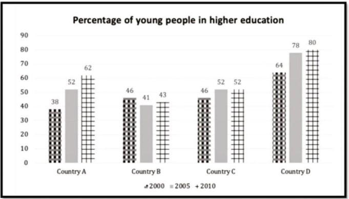
The yielded bar charts demonstrate four different countries namely Country A, County B, County C and County D young students percentage in higher education in 2000, 2005 and 2010.
Overall, ut can be clearly seen that year by year proportion was rose in all countries except Country B. Additionally, County D had the highest percentage in all years.
For Country A, in 2000, young people who studying higher education was 38% which grew dramatically and continuously roughly one in tenth percentage per half a decade. In 2010 had 62%. For Country B and C, the percentage was identical in 2010 although, later it differ. Former one nation proportion drop 5% after 5 years and remained at 43% in final year. However, later country percentage rose and remained unchanged till 2010, it had same proportion as County A had in 2005.
For Country D, with the highest proportion in 2000, this country had on account of 64% which surged later, between 2000 and 2005, it climbed sharply 14%. In 2010 percentage was four in fifth and between a decade, it rose 16% which was second highest after Country A.
Follow Us on IELTSFever Instagram for more updates and the latest test tasks.
Also Read Some Employers Offer Their Employees Subsidized Membership of Gym