The Chart Below Shows the Value of One Country’s Exports in Various Categories During 2015 and 2016. the Table Shows the Percentage Change in Each Category of Exports in 2016 Compared with 2015. Summarise the Information by Selecting and Reporting the Main Features, and Make Comparisons Where Relevant.
 Sample Answer: The Chart Below Shows the Value of One Country’s Exports in Various Categories
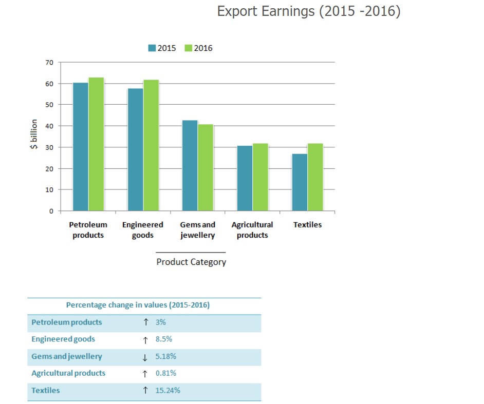
The bar graph illustrates the value of five items from various product categories exported from a particular nation between 2015 and 2016. The table outlines the percentage change in every category between 2015 and 2016.
The chart clearly shows that four items increased their exporting materials over time, whereas only one decreased. Data from the table reveals that textiles rose sharply compared to petroleum products, engineered goods, and agricultural products, but gems and jewellery fell in small portions over the period recorded.
Despite the steady decline of gems and jewellery from a little more than 40 $ billion to exactly 40 $ billion from 2015 to 2016 consecutively, the other product categories grew in direct proportion to time, reaching a maximum peak of just above 60 $ billion of petroleum products in 2016.
According to the table, textiles improved steeply, with a considerable percentage of 15.24, followed by half of the engineered goods that textiles had. On the other hand, petroleum products were the least exported, at 3 %, despite the drop in gems and jewellery, with 5.18 %.
Follow us on the IELTSFever Facebook Page for more updates
Discover more from IELTS Fever
Subscribe to get the latest posts sent to your email.