Sample: The Chart Below Shows Waste Collection by A Recycling Center from 2011 to 2015
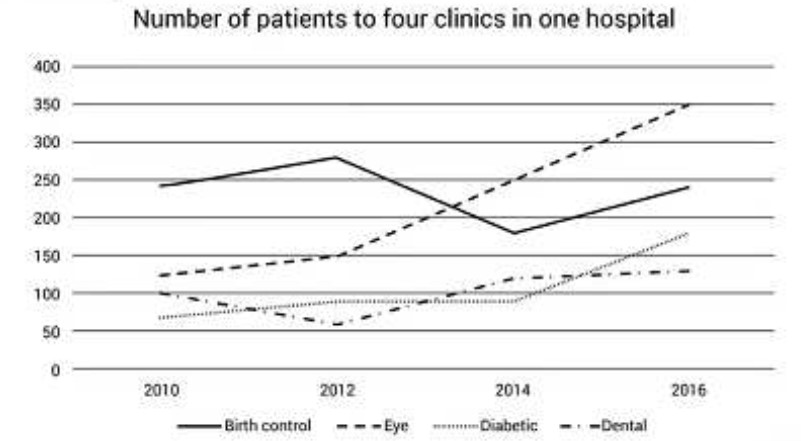
The given line graph illustrates information about how many sick individuals were in four different types of hospitals (birth, eye, diabetic, and dental) over six years between 2010 and 2016.
Overall, the line chart reveals that the number of eye and diabetic patients increased, while the other two had fluctuating patient numbers.
At first, the number of people with eye problems was around 120 in 2012, and it climbed to 350 patients in 2016, the highest number of patients in any other hospital. As for the diabetic patients, there were around 70 in 2012, and it went up slightly to 90 patients in 2014, and at the end of the period, it increased at its peak to approximately 130 patients.
Also, Read Recent Research Suggests That the Majority of Criminals Who Are Sent to Prison
In 2010, the birth control hospital had the highest number of patients, which was nearly 250, and this number rose to about 275 in 2012, but it decreased rapidly to around 170 in 2014; however, at the end of the period, it stopped where it started. Dental patients had the same trend as birth control patients; it started at 100 in 2012 and declined gradually to 60 in 2012, but it grew to approximately 120 in 2014, and in 2016, it remained the same.
Discover more from IELTS Fever
Subscribe to get the latest posts sent to your email.