The Graph Below Shows the Quantities of Goods Transported in the UK between 1974 and 2002 by four different modes of Transport. Summarise the information by selecting and reporting the main features and making comparisons where relevant.
 Sample Answer: The Graph Below Shows the Quantities of Goods Transported in the UK
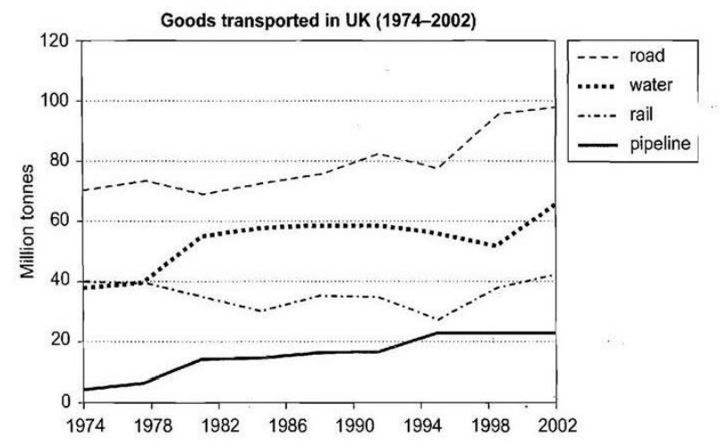
The line graph delineates the data on the quantities of products shipped in the United Kingdom territory by four separate types of transport from 1974 to 2002.
Overall, over time, road transport has become the most popular means of transport across the country. In contrast to the modes of transport, pipeline transport was the least popular. On the other hand, both railway and water were slightly alike in the beginning, but later on, each of them became unlikely.
Pipeline transport steadily rose between 1974 and 1994, at a little less than 10 and almost 20 million tonnes, respectively. After that, it experienced a plateau period since 1995, at just above 20 million tonnes. Apart from that, road transport was a lovely and considerable way of transport, with approximately 70 million tonnes in the beginning. However, it passed through an erratic journey with an outstanding peak of nearly 100 million tonnes.
Initially, railway consumption was negligible compared to water transport; nevertheless, from 1977 onwards, people considered water the simplest way to ship their commodities, with a maximum peak of well above 60 and a trifling over 40 million tonnes.
Follow us on the IELTSFever Facebook Page for more updates
Discover more from IELTS Fever
Subscribe to get the latest posts sent to your email.