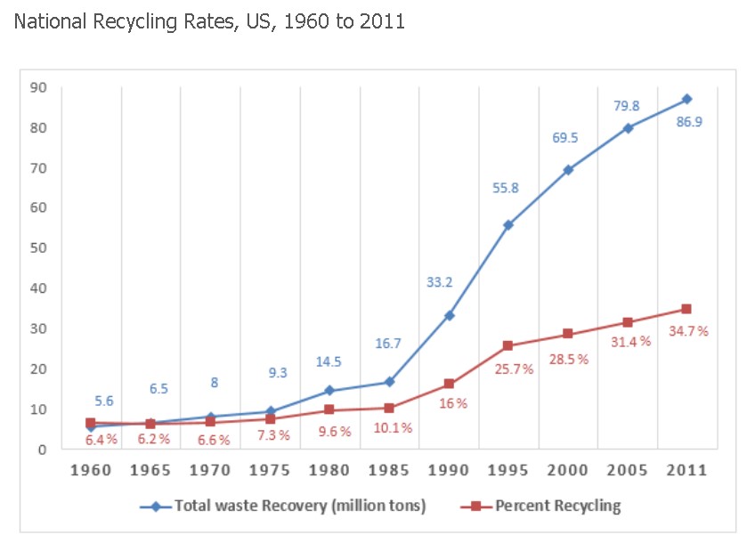
 The given line chart illustrates the information related to the garbage recycled from collected waste in the US over 51 years between 1960 and 2011. Units in the waste collection were measured in millions of tons, and recycled waste was measured in percentages.
Overall, the line graph reveals that the gap between recycling and waste collection increased, which shows that waste collected was higher as compared to recycling. Another interesting fact is that both had an increasing trend.
At first, in 1960, the margin between waste collection and recycling was the opposite, which was 5.6 million tons and 6.4% recycled waste; however, it was balanced in the next half-decade, and it became wider as garbage collection was increased gradually to 16.7 million tons and only 10.1% of waste was recycled.
Follow Us On IELTSFever Facebook Page For More Updates
Moreover, the trend remained the same, and total waste recovered increased dramatically to 69.5 million tons in two and a half decades, while, compared to that, only 28.7% of waste was recycled. At the end of the given period, the waste collection peaked at 86.9 million tons, and the same goes for recycled waste (31.7%).
Discover more from IELTS Fever
Subscribe to get the latest posts sent to your email.