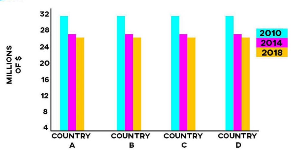
The bar chart demonstrates health sponsorship variations in four states between 2010 and 2018. 📊
Overall, millions of dollars for medical purposes decreased over time in each country. However, some countries’ funding amounts remained the same throughout the period.
The world experienced the highest funding levels in 2010, with both countries receiving around 32 million dollars. 📈 However, the amount declined dramatically in 2014, with a difference of roughly 5 million dollars.
Furthermore, the lowest funding provided across the four countries was approximately 25 million dollars in 2018. 📉 On the other hand, there was a slight change of nearly 2 million dollars from 2014 to 2018.
For More Updates Follow Us on IELTSFever Facebook Page
Discover more from IELTS Fever
Subscribe to get the latest posts sent to your email.