


The Line Graph Shows the Cost of Watching Films. The pie Charts Show the Change in The Percentage of Market Share Represented by The Three Forms.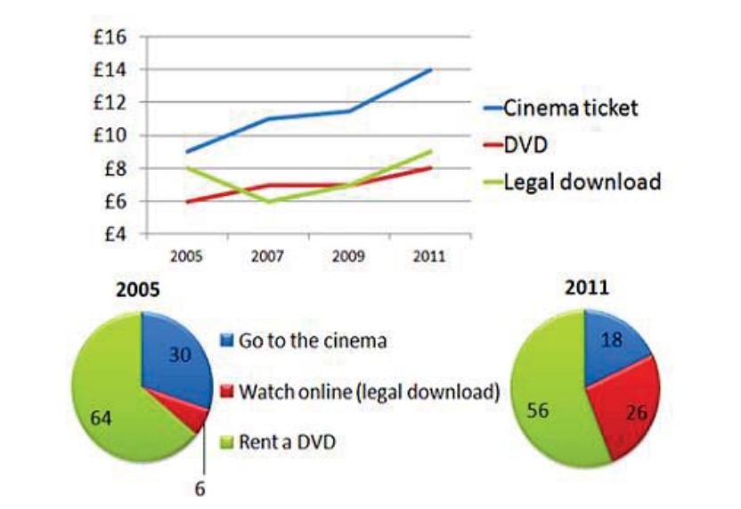
The given linear chart depicts the number of people watching films, while the pie chart shows the ratio of market share.

The linear chart reveals that cinema tickets are the most expensive option, while DVDs are the least expensive. Eventually, both legal downloads and DVDs present lower rates than Cinema tickets throughout the whole period.
The percentage of legal downloads was the lowest in 2005, but it steadily developed in 2011; however, in comparison, both legal downloads and going to the cinema illustrated small costs, but in 2011, they changed more.
Moreover, renting a DVD is the largest category presented in the round chart, with 8 pounds allocated in 2005 or 14 pounds in 2011, which is unbelievable progress.
Follow Us On IELTSFever Facebook Page For More Updates