


The Line Graphs Below Show the Production and Demand for Steel in Million Tonnes and The Number of Workers Employed in The Steel Industry in The Uk in 2010. Summarise the Information by Selecting and Reporting the Main Features, and Make Comparisons Where Relevant.

The two line graphs demonstrate the demand and production of steel in million tonnes alongside the number of employees recruited into the steel industry within the United Kingdom in 2010.
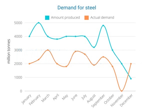
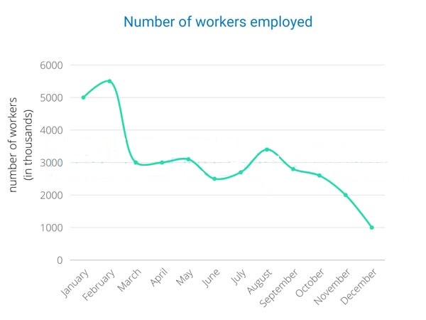
Overall, the production of steel materials in the United Kingdom was considerably higher compared to its actual demand in the local market. Moreover, this trend resulted in the employment rate declining throughout the period of one year.
Steel production experienced an erratic journey from January to September over nine months, with a maximum peak of 5000 million tonnes in February. Afterwards, production decreased massively with time. Furthermore, December was the least productive month, with less than 1000 million tonnes.
The Actual demand for steel was smaller compared to its production rate. Residents in the UK manifested a significant fall in steel demand at 0 tonnes; however, it started to rise instantly up to December with a demand of 2000 million tonnes. Not to forget, the steel industry’s employment rate fell from approximately 5500 to exactly 1000 in December.
Follow Us on the IELTSFever Facebook Page for More Updates