The pie chart and table below give information on tourists visiting Australia. Summarise the information by selecting and reporting the main features, and make comparisons where relevant.
Sample Answer: The pie chart and table below give information on tourists visiting Australia
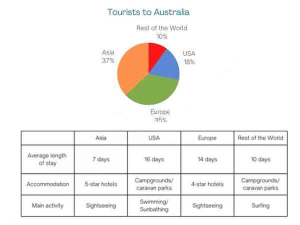
The Statistics provided in the form of pie diagrams and tabulations suggest insight into globetrotters touring Australia. Asians dominated the Australian tourist space among four categories worldwide.
The pie chart shows the percentage of explorers from the USA, Asia, Europe, and the Rest of the World who visited Australia. Asians grabbed the lion’s share with 37%, whereas the Rest of the World secured only 10% of visitors. However, in this pie chart, the USA is a lone participant country; the Rest of the categories are groups of countries.
Among all groups, Asians are the only visitors who opted for 5-star hotels. However, this is the group that stayed the shortest duration in Australia. Moreover, the primary purpose of the visit is sightseeing. In contrast, the USA and the Rest of the World groups choose Campgrounds / Caravan parks as their shelter, and their main activities are somewhat related to water, like surfing and swimming/sunbathing.
In conclusion, Asians make up a high percentage. In addition, these are people who spend on luxury stays with shorter trips. However, the Rest of the world’s visitors are only 10%, and most show interest in ocean sports, such as surfing.
Follow us on IELTSFever Facebook Page for more updates