


The pie chart below shows energy is used in a typical Australian household, and the table shows the amount of electricity used according to the number of occupants. Summarize the information by selecting and reporting the main features, and make comparisons where relevant.

Sample Answer of The Pie Chart Below Shows Energy Is Used in a Typical Australian
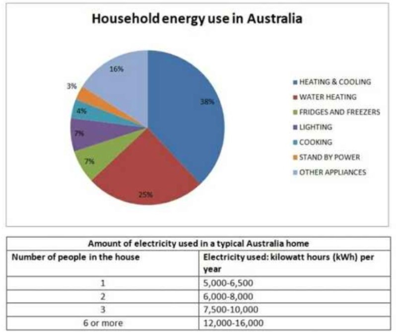
The provided pie charts demonstrate the percentage of 7 different usages of energy in the household in Australia and table illustrates the number of people in the house wise per year used electricity, and it is on yearly basis and data given in kilowatt-hours.
Overall, the most usage on hearing and cooking and water heating while on stand by the power used was on the least. Additionally, with the rising person in the house, kWh is also increasing.
A quarter proportion of energy use on water heating by Australian citizen while for heating and cooking usage is 38%. Fridge and freezer and lighting usage have the same percentage on account of 7%, and just above that proportion is other applicants. 3% and 4% used on stand by power and cooking respectively.
The most used kWh per year is 12000 to 16000 kWh when 6 or more people lived in the same house in Australia; however, below a half usage was a single person. Usage of 2 people had 6000 to 8000kwt, and if 3 people lived then, it used between 7500 to 10000.