


The pie charts below give information on the ages of the populations of Oman and Spain in 2005 and projections for 2055. Summarise the information by selecting and reporting the main features and make comparisons where relevant. Write at least 150 words

Sample Answer of The Pie Charts Below Give Information on the Ages of the Populations
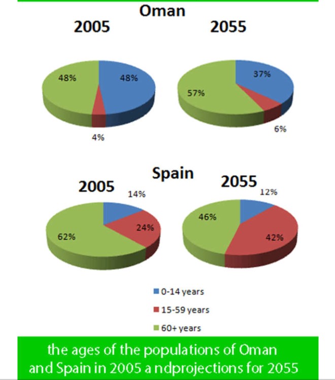
The given pie charts demonstrate two countries, Oman and Spain populations which are divided into three categories by ages in 2005 and forecasted it for 2055.
Overall, in both countries older people’s pollution was higher than other age groups additionally, it is predicted that it will continue till 2055.
For Oman, the age between 1 to 14 years and above 60 years population in 2005 was coincidently same on account of 48%, only 4% 14 to 59 years people. Moreover, prediction is that after a half-century youths number will drop and older people number will jump up dramatically, we can see nearly a tenth percentage slip in 0 to 14 years group whereas, the same percentage will rise in 60 plus categories, for both categories middle age, the population will stand at 6%.
For Spain, roughly a quarter proportion was for 15 to 59 years old citizen while 14% was for 0 to 14 years, the majority of percentage was for over 60 years, it was 62%. It predicts that in 2055, 15 to 59 age categories layman will grow a fifth. However, the number of 0 to 14 and 60 plus years group mankind fall and will have 12% and 46% respectively.