


The pie charts below show the percentage of housing owned and rented in the UK in 1991 and 2007. Summarize the information by describing the main features of the charts and making comparisons where appropriate.
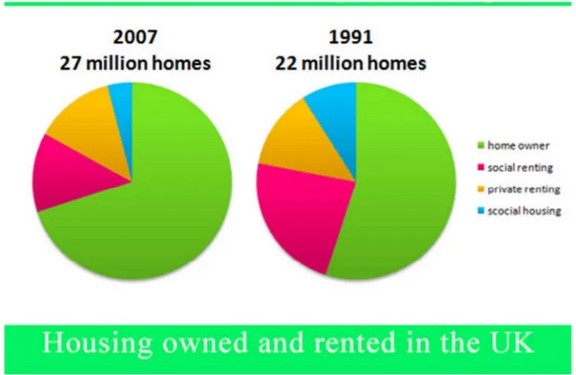
The two pie charts compared housing owned and rented like a homeowner, social housing, social renting and private renting in terms of percentage, in the UK in two different years 1991 and 2007.

Overall, in both years, homeowners proportion was highest as compared to other components. However, social housing was the last category. The number of houses was also rose steadily after 16 years.
In 1991, the number of houses had 22 million. Homeowners were around 55% which was the highest in that period. Additionally, the next largest sector was social rented homes, accounting for a quarter or 23%, social housing and private renting were the least proportion that year, roughly one in ten and 13% respectively.
In 2007, homeowners were rose to 70%, which was 15% higher than the 1991 year contrary, social housing was fell to 6% and remained 3% that was lower in this year. Moreover, Privately rented homes remained the same at 13%, social renting was also plunge, accounting to a 12%with lower sector. The number of houses had also grown to 5 million.
Follow Us on IELTSFever Twitter for more updates