The charts below show the United States spending patterns between 1966 and 1996. To summarize the information by selecting and reporting key characteristics and comparing where appropriate.
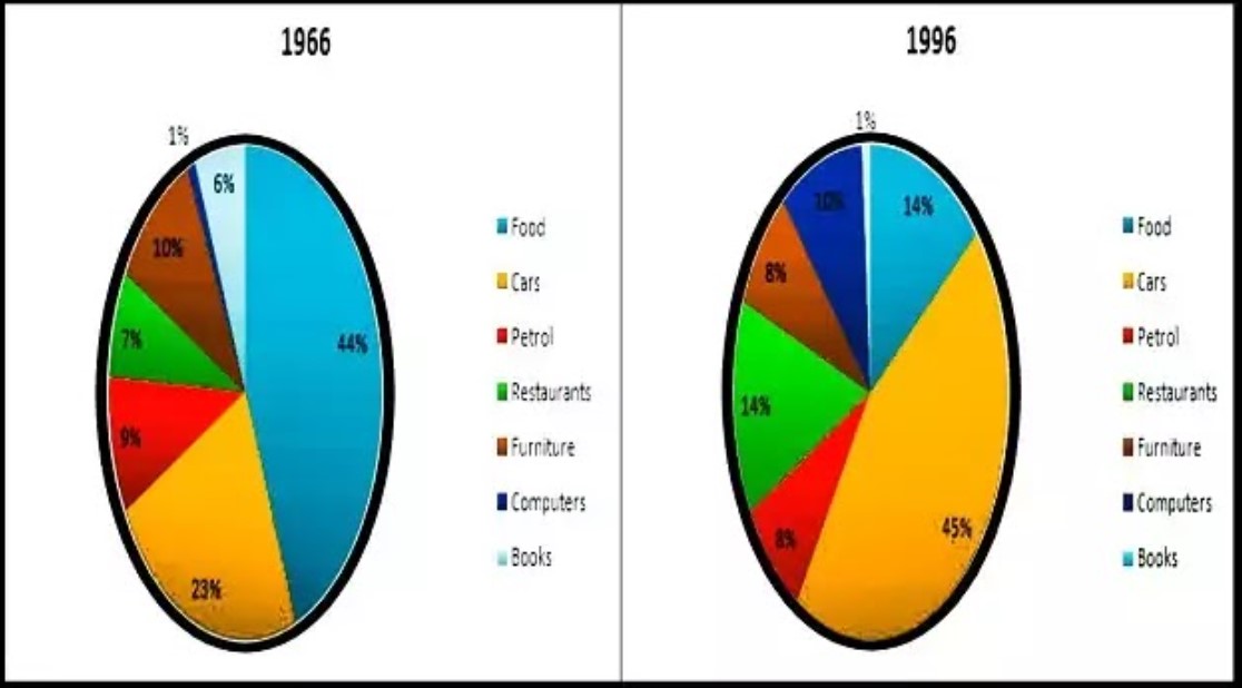
The yielded pie charts illustrate seven different spendings namely food, cars, petrol, restaurant, furniture computer and books in the USA from 1966 to 1996.
Overall, computer spending proportion was on the least while foods on top in starting year. In 1966 books became the lowest and cars had the majority of percentage.
In 1966, people 44% spent on food although, cars proportion was half than food. A quarter percentage of spending was on furniture, and just 1 % low was on petrol. For restaurant and books had nearly same preferences. Computers had only 1 %.
After three decades, cars had the same proportion as food had in 1966, and the same was for food. Spending on restaurants rose and had double percentage. Spending on computers grew 5%, but 2% declined in furniture. Books have the same preference as the computer had 30 years ago. Petrol had 8%.
Follow Us on IELTSFever Instagram for more updates and the latest test tasks.
Also, Read The Bar Chart Below Shows the Percentage of Australian Men and Women
Discover more from IELTS Fever
Subscribe to get the latest posts sent to your email.