ACADEMIC WRITING TASK 1

The Two Bar Charts Show the Proportion of 14-16-year-old Students Studying

The Two Bar Charts Show the Proportion of 14-16-year-old Students Studying

The Two Bar Charts Show the Proportion of 14-16-year-old Students Studying a Modern Foreign Language in An English-speaking country and The Top Three Popular Foreign Languages. Summarise the Information by Selecting and Reporting the Main Features and Making Comparisons Where Relevant. The two bar charts illustrate the number of children who learned to speak foreign […]

The Two Bar Charts Show the Proportion of 14-16-year-old Students Studying Read More »

The Chart Below Shows the Amount of Money Spent on Fast Food

The Chart Below Shows the Amount of Money Spent on Fast Food

The Chart Below Shows the Amount of Money Spent on Fast Food in Britain per Week. The graph shows the Trends in The Consumption of Fast Food. Write a Report for A University Lecturer Describing the Information Shown Below. Britain’s Expenditure on fast food per week is illustrated in the chart, along with the graph

The Chart Below Shows the Amount of Money Spent on Fast Food Read More »

The Table Below Shows how Many Tourists from Five Countries Visited

The Table Below Shows how Many Tourists from Five Countries Visited

The Table Below Shows how Many Tourists from Five Countries Visited Australia in Different Years from 1991 -1999. (unit: Thousands). Describe the Information in The Table and Make Comparisons Where Appropriate. The table illustrates the level at which different age groups make use of the cloud to do activities such as (Getting news, online games,

The Table Below Shows how Many Tourists from Five Countries Visited Read More »

The Graphs Below Show Three Exports from South East Asia

The Graphs Below Show Three Exports from South East Asia

The Graphs Below Show Three Exports from South East Asia and The Four Sources of Revenue for 1970 and 1995. Write a Report for A University Lecturer Describing the Information Shown Below. The diagram below illustrates a graph of international trade from Southeast Asia and pie charts depicting four sources of revenue from 1970 to

The Graphs Below Show Three Exports from South East Asia Read More »

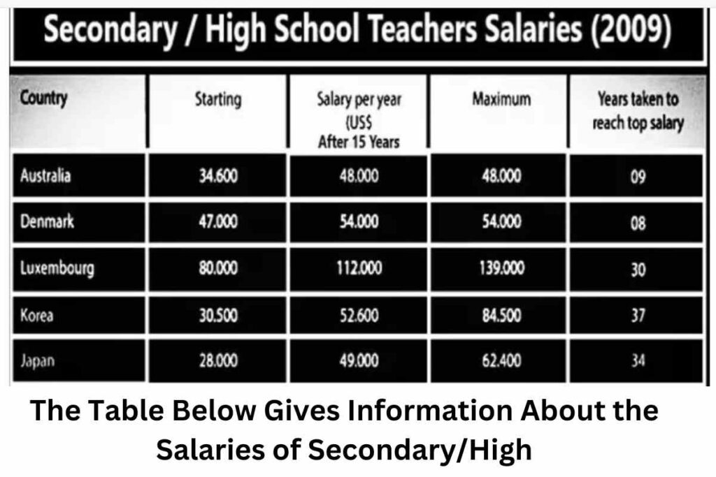
The Table Below Gives Information About the Salaries of Secondary/High

The Table Below Gives Information About the Salaries of Secondary/High

The Table Below Gives Information About the Salaries of Secondary/High School Teachers in Five Countries in 2009. Summarise the Information by Selecting and Reporting the Main Features and Make Comparisons Where Relevant. The data in the table shows particulars about how five different countries paid their secondary/high school teachers in 2009. Overall, it provides information

The Table Below Gives Information About the Salaries of Secondary/High Read More »

The Two Pie Charts Below Show the Percentages of Industry Sectors

The Two Pie Charts Below Show the Percentages of Industry Sectors

The Two Pie Charts Below Show the Percentages of Industry Sectors’ Contributions to The Economy of Turkey in 2000 and 2016. Summarize the Information by Selecting and Reporting the Main Features and Making Comparisons Where Relevant. The two pie charts represent the percentage of different industrial sectors which contributed to the economy of Turkey from

The Two Pie Charts Below Show the Percentages of Industry Sectors Read More »

The Table Below Gives Information About the Underground Railway

The Table Below Gives Information About the Underground Railway

The Table Below Gives Information About the Underground Railway Systems in Six Cities. Summarise the Information by Selecting and Reporting the Main Features and Making Comparisons Where Relevant. Sample 1: The Table Below Gives Information About the Underground Railway The table illustrates underground trains in different megacities. Moreover, it provides information about monorail routes and

The Table Below Gives Information About the Underground Railway Read More »

The Chart Shows the Average Life Expectancy for Males and Females

The Chart Shows the Average Life Expectancy for Males and Females

The Chart Shows the Average Life Expectancy for Males and Females in 1990, 1950 and 1990. Summarise the Information by Selecting and Reporting the Main Features and Making Comparisons Where Relevant. Sample 1: The Chart Shows the Average Life Expectancy for Males and Females The table provides data on men’s and women’s lifespans in 1900,

The Chart Shows the Average Life Expectancy for Males and Females Read More »

The Table Below Gives Information About the Underground Railway

The Table Below Gives Information About the Underground Railway

The Table Below Gives Information About the Underground Railway Systems in Six Cities. Summarise the Information by Selecting and Reporting the Main Features and Making Comparisons Where Relevant. Sample 1: The Table Below Gives Information About the Underground Railway The bar chart illustrates the intensity of people in 2003 and changes up to 2005. Overall,

The Table Below Gives Information About the Underground Railway Read More »

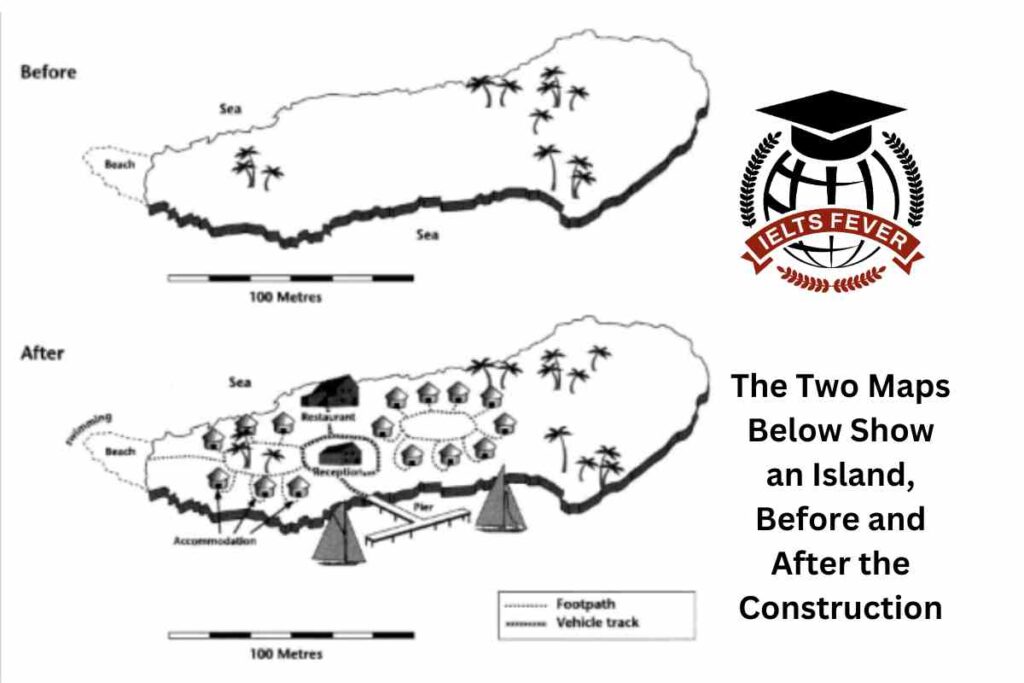
The Two Maps Below Show an Island, Before and After the Construction

The Two Maps Below Show an Island, Before and After the Construction

The Two Maps Below Show an Island, Before and After the Construction of Some Tourist Facilities. Summarize the Information by Selecting and Reporting the Main Features, and Make Comparisons Where Relevant. You Should Write at Least 150 Words. Sample 1: The Two Maps Below Show an Island, Before and After the Construction The island is

The Two Maps Below Show an Island, Before and After the Construction Read More »

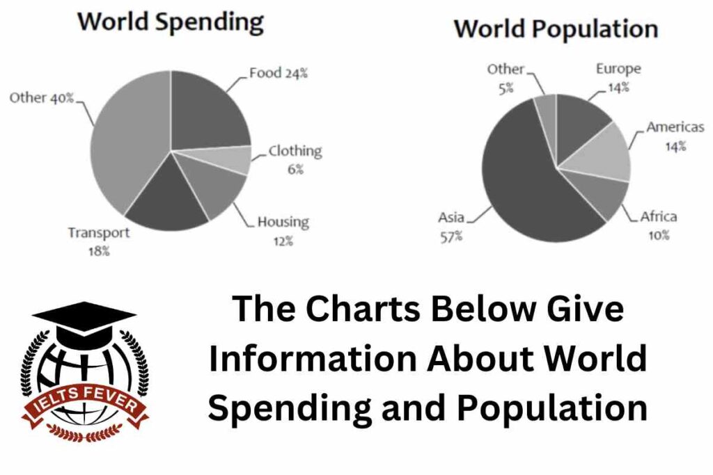
The Charts Below Give Information About World Spending and Population

The Charts Below Give Information About World Spending and Population

The Charts Below Give Information About World Spending and Population. Summarise the Information by Selecting and Reporting the Main Features, and Make Comparisons Where Relevant. Sample 1: The Charts Below Give Information About World Spending and Population The two pie charts represent information about world spending and world population. Overall, even though numerous fluctuations can

The Charts Below Give Information About World Spending and Population Read More »

Scroll to Top