ACADEMIC WRITING TASK 1

The Table Below Gives Information on The Proportion of Carbohydrates: AC Writing Task 1

The Table Below Gives Information on The Proportion of Carbohydrates AC Writing Task 1

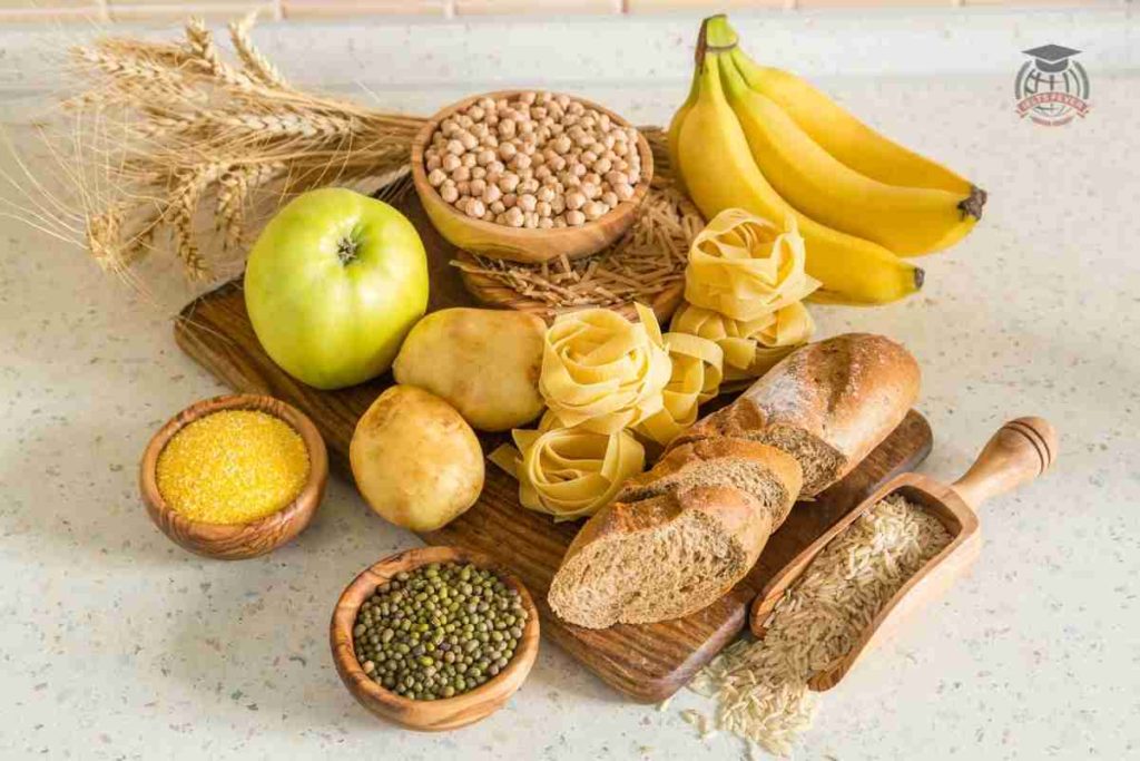
The table below gives information on the proportion of carbohydrates, protein and fat in three different diets. Write a report for a university lecturer describing the information shown below. Make comparisons where relevant. The pie chart reflects the number of carbohydrates, protein, and fat in three several diets. The data is calibrated in percentage. Overall, […]

The Table Below Gives Information on The Proportion of Carbohydrates: AC Writing Task 1 Read More »

The Pie Charts Below Show Units of Electricity Production by Fuel Source in Australia and France

The Pie Charts Below Show Units of Electricity Production by Fuel Source in Australia and France

The pie charts below show units of electricity production by fuel source in Australia and France in 1980 and 2000. Write a report for a university lecturer describing the information shown below, and make comparisons where relevant. The chart illustrates the manufacturing of units of electricity by several five fuels sources in the nation Australia

The Pie Charts Below Show Units of Electricity Production by Fuel Source in Australia and France Read More »

The Table Below Gives Information About the Underground Railway Systems in Six Cities: Ac Writing Task 1

The Table Below Gives Information About the Underground Railway Systems in Six Cities Ac Writing Task 1

The table below gives information about the underground railway systems in six cities. Write a report for a university lecturer describing the information shown below. Make comparisons where relevant. The chart illustrates the details of the underground railway network in six several cities over the centuries. Overall, it is immediately apparent from the chart that

The Table Below Gives Information About the Underground Railway Systems in Six Cities: Ac Writing Task 1 Read More »

The Graph Below Gives Information About International Migration to The UK

The Graph Below Gives Information About International Migration to The UK

The graph below gives information about international migration to the UK, 1999-2008. Write a report for a university lecturer describing the information shown below. Make comparisons where relevant. The chart illustrates the resettlement of oversea individuals to the UK in nine years. Overall, it is immediately apparent from the graph that individuals who shifted to

The Graph Below Gives Information About International Migration to The UK Read More »

The Diagram Below Shows how Coffee Is Produced and Prepared for Sale: AC Writing

The Diagram Below Shows how Coffee Is Produced and Prepared for Sale AC Writing

The diagram below shows how coffee is produced and prepared for sale in supermarkets and shops. Summarise the information by selecting and reporting the main features, and make comparisons where relevant. The process chart illustrates the coffee production and how the powder is prepared for sales in supermarkets and shops. Overall, the process includes eleven

The Diagram Below Shows how Coffee Is Produced and Prepared for Sale: AC Writing Read More »

The Chart Shows British Emigration to Selected Destinations Between 2004 and 2007: AC Writing Task 1

The Chart Shows British Emigration to Selected Destinations Between 2004 and 2007 AC Writing Task 1

The chart shows British Emigration to selected destinations between 2004 and 2007. The bar chart delineates the ratio of British people who moved overseas over three years. Overall, it is immediately apparent from the chart the that highest number of British natives expatriate themself in Australia and Spain was the second-largest destination for them. In

The Chart Shows British Emigration to Selected Destinations Between 2004 and 2007: AC Writing Task 1 Read More »

The Table Shows the Proportion of Pupils Attending Four Secondary School Types Between 2000 and 2009

The Table Shows the Proportion of Pupils Attending Four Secondary School Types Between 2000 and 2009

The table shows the Proportion of Pupils Attending Four Secondary School Types Between 2000 and 2009. Summarise the information by selecting and reporting the main points and give comparisons where relevant. The chart depicts the percentage of children taking part in different four secondary schools over nine years. Overall it is immediately apparent from the

The Table Shows the Proportion of Pupils Attending Four Secondary School Types Between 2000 and 2009 Read More »

The Pie Chart Shows the Amount of Money that A Children’s Charity Located in The USA: AC Writing Task 1

You Are Going to Hold a Birthday Party for A Friend GT Writing Task 1

The pie chart shows the amount of money that a children’s charity located in the USA spent and received in one year. Summarise the information by selecting and reporting the main points and give comparisons where relevant. Sample Answer The Pie Chart Shows the Amount of Money that A Children’s Charity Located in The USA:

The Pie Chart Shows the Amount of Money that A Children’s Charity Located in The USA: AC Writing Task 1 Read More »

The Chart Below Shows Information About Changes in Average House Prices in Five Different Cities

The Chart Below Shows Information About Changes in Average House Prices in Five Different Cities

The chart below shows information about changes in average house prices in five different cities between 1990 and 2002 compared with the average house prices in 1989. Write a report for a university lecturer describing the information shown below. Make comparisons where relevant. The chart illustrates the swapped the cost of average houses in five

The Chart Below Shows Information About Changes in Average House Prices in Five Different Cities Read More »

The Table Below Shows the Proportion of Different Categories of Families Living in Poverty

The Table Below Shows the Proportion of Different Categories of Families Living in Poverty

The table below shows the proportion of different categories of families living in poverty in Australia in 1999. Write a report for a university lecturer describing the information shown below. Make comparisons where relevant. The tabular chart illustrates the percentage of seven categories of households engaged with destitution life in Australia in 1999. Overall, it

The Table Below Shows the Proportion of Different Categories of Families Living in Poverty Read More »

The Pie Charts Show the Electricity Generated in Germany and France from All Sources and Renewables in The Year 2009: AC Writing Task 1

The Pie Charts Show the Electricity Generated in Germany and France from All Sources and Renewables in The Year 2009 AC Writing Task 1

The pie charts show the electricity generated in Germany and France from all sources and renewables in the year 2009. The chart illustrates electricity manufacturing with several methods in Europe countries in 2009. Overall it is immediately apparent from the chart Germany had the maximum production of electricity and France also followed the same value in

The Pie Charts Show the Electricity Generated in Germany and France from All Sources and Renewables in The Year 2009: AC Writing Task 1 Read More »

The Table Below Gives Information on UK Acid Rain Emissions, Measured in Millions of Tonnes

The Table Below Gives Information on UK Acid Rain Emissions, Measured in Millions of Tonnes

The table below gives information on UK acid rain emissions, measured in millions of tonnes, from four different sectors between 1990 and 2007. Write a report for a university lecturer describing the information shown below. Make comparisons where relevant. The chart illustrates the acid rain outflow in four several sections in the UK over 17

The Table Below Gives Information on UK Acid Rain Emissions, Measured in Millions of Tonnes Read More »

Scroll to Top