The bar chart illustrates population trends globally by percentage from 1950 to 2040. Summarize the information by selecting and reporting the main features, and make comparisons where relevant.
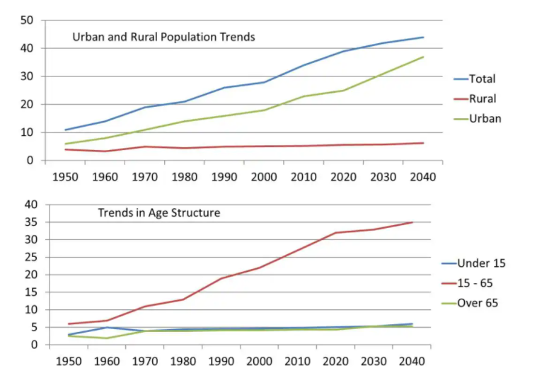
The yielded line bar charts demonstrate the percentage of urban and rural areas population trends and age-wise worldwide trends between 1950 and 2040.
Overall, it can be clearly seen that total and urban population rose will continue additionally, age group 15 to 65 people number was higher than others, and it will continue to jump up.
For area wise trends, in 1950, the total population was one in the tenth percentage, it increased dramatically, and after 70 years it was 40%. And it will take forecasting that in 2040, it touched its zenith point on account of 44%. Rural areas population proportion was only 4%, and it will remain unchanged till 2040. Moreover, a half one in the tenth percentile of the population in the Urban side, which grew later in 2020, is a quarter percentage, and after two decades, it rose 14%.
Forage trends, juveniles and golden-ager proportion were the same in 1950, and later throughout the period, both percentages were identical. After 2020 it will remain unchanged although the former touched its peak in 1960 whereas the latter one touched dip insane years. It is predicted that in 2040 the percentage will be 6%. Furthermore, age group 15 to 65 age groups had 7% which was same till 1960 but, later it goes upwards and will be 35% in 2040.
Follow Us on IELTSFever Instagram for more updates and the latest test tasks.
Also, Read The Pie Chart Gives Information About the Country of Birth of People
Discover more from IELTS Fever
Subscribe to get the latest posts sent to your email.