


The chart below shows the proportions of the world’s oil resources held in different areas, together with the proportions consumed annually in the same areas—Summaries the information by selecting and reporting the main features and making comparisons where relevant.
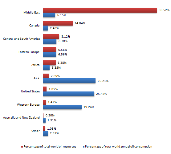

The render bar charts enumerate how many percentages of oil resources are available in a different part of the world with consumption on a yearly basis.
Overall, it can be clearly seen that in the majority of the parts usage is more than total resources especially in western parts of the world.
For the total world oil source, the majority proportion of oil available in the Middle East on account of 56.28% while the least in Australia and New Zealand, below 1%. In Canada, the percentage is half one third which is the second most percentage. Furthermore, with nearly 6% of Eastern Europe and Africa having the same proportion of oil resources, this is double than has in Asia. Other parts have only 1% whereas the USA and Western Europe has double proportion than has in other. 8 % of total world oil is in Central and South America.
For consumption, roughly a quarter percentage of the world’s annual oil use by Asia and the United States. Middle East, Central and South America and Eastern Europe consume the same proportion of oil annually on account of just over 6%. Moreover, 2% is consumed by Canada and Other which is half that of Africa. Oil usage by unites states and Western Europe is near 1%.
Follow Us on IELTSFever Twitter for more updates