The charts below show changes in the proportion of energy produced from different resources in a country in 1985 and 2003. Summarise the information by selecting and reporting the main features and making comparisons where relevant.
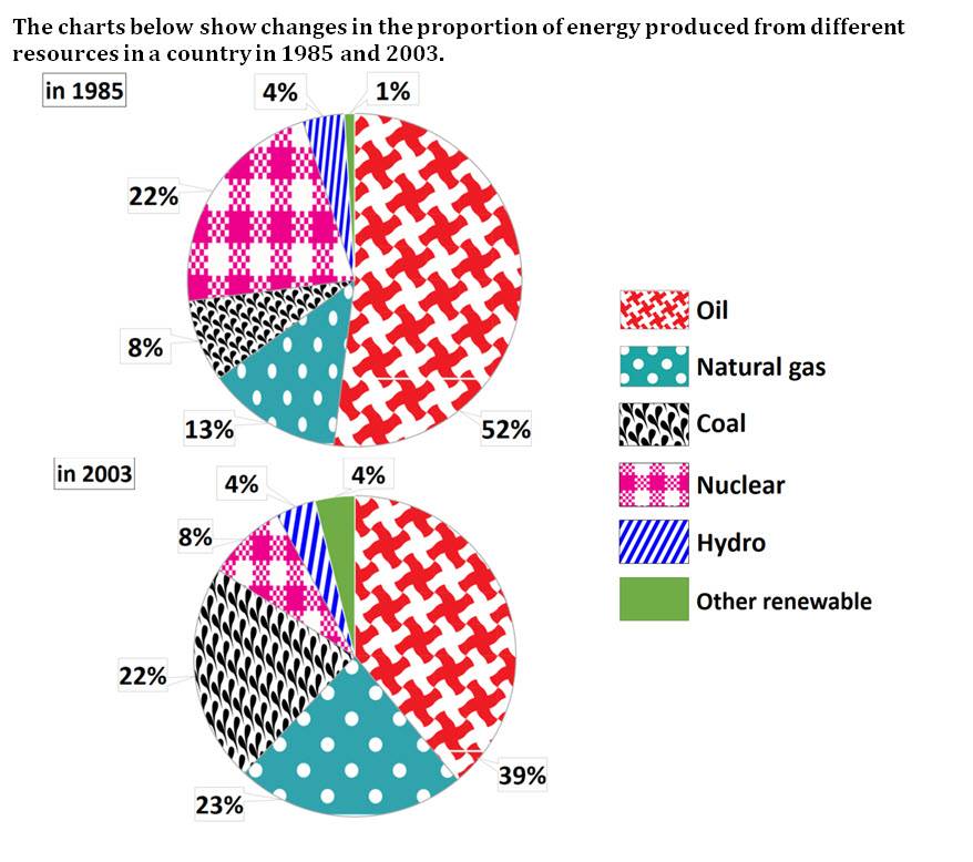
The rendered circular charts depict the information about the modifications which were occurred in the ratio of energy generated from different kinds of sources such as oil, natural gas, coal, nuclear, hydro and other renewable energy in a nation ranging from 1985 to 2003
Overall, it is lucid that the maximum proportion of power was produced from oil in both years, whereas other non-conventional sources were participating in less ratio to generate energy.
Having a deep look at the pie charts, it is evident that production of energy from oil was decreased by 13% in 2003, which was noticed for 59% in 1985. However, power produced from coal increased to two-fifth ratio. Just 1% power was generated from another non-conventional source, which was increased by the small change that was of 3% after 18 years.
Moving forward to the rest description of the circular charts, energy was produced from hydro in both years in the same proportion that was witnessed for 4%. In 1985, nuclear participated in producing 22%, which reduced and accounted for below one-tenth in 2003.13% and 23% noticed for production of energy from natural gas in 1985 and 2003, respectively.
Follow Us on IELTSFever Twitter for more updates
Discover more from IELTS Fever
Subscribe to get the latest posts sent to your email.