The charts below show the percentage of the energy generate from different resources in a country in 1985 and 2003. To summarize information by selecting key characteristics and compiling a report and, if necessary, making a comparison.
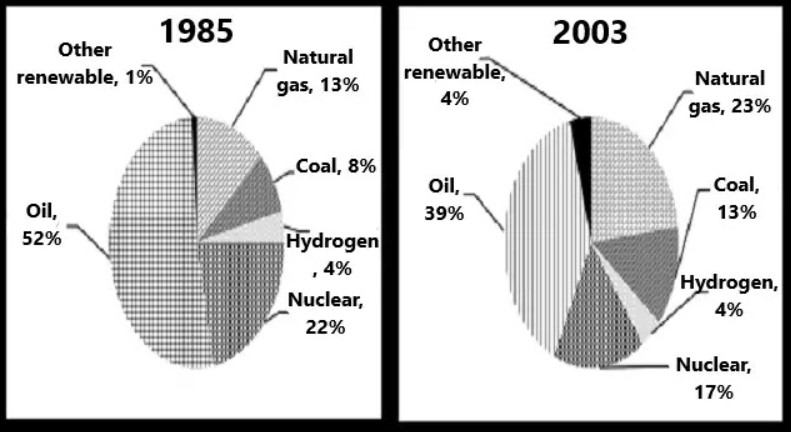
The involvement of various energy sources in the generation of Power in a country between 1985 and 2003 is illustrated in the pie charts.
To begin with, the Share of oil remained the highest during the period, as it was 52% in 1985 and reduced to 39% by 2003. Further, Power produced from natural gases contributed merely 13% in 1985 had shared around a quarter by 2003. A similar trend was also observed in coal energy, with an increment of 5% in the period of 18 years.
In contrast to this, In 2003, 17% share of total Power was of nuclear energy which was accounted for 22% in 1985.
It is evident from the charts that there was no change had been occurred in the Power from hydrogen energy during the span of period. Although, an only slight increase was seen in the other renewable energy sources in around two decades, by 3%.
Overall, over time, a positive pattern was noticed in the case of oil, natural gas, coal and other renewable energy sources of Power and a negative pattern in the case of nuclear Power while no change has happened in hydrogen energy.
Also Read The Chart Below Shows Information About the Challenges People Face
Follow Us on IELTSFever Twitter for more updates
Discover more from IELTS Fever
Subscribe to get the latest posts sent to your email.