The Charts Below Show the Proportion of People’s Total Spending in A Particular

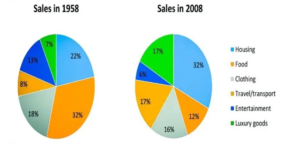
The Charts Below Show the Proportion of People’s Total Spending in A Particular European Country that Was Spent on Different Commodities and Services in 1957 and 2008. Summarise the Information by Selecting and Reporting the Main Features and Making Comparisons Where Relevant.

The charts below show the proportion of people's total spending in a particular European country that was spent on different commodities and services in 1957 and in 2008.The pie charts provide information about the European people’s expenditure on various commodities and services in 1958 and 2008. Overall, these charts display the ups and downs in sales over half of the century in an unnamed country in Europe.

In 1958, people spent more money on food, which became one-third of the total sales. This was followed by housing and clothing. In contrast, Sales of entertainment, Travel/Transport, and Luxury goods have become feeble. They are barely nearer to ten per cent of the overall sales.

But in 2008, there was a drastic change in the sales of Housing, Travel/transport, Luxury goods, and Food. Only some changes were seen in Clothing. Compared to 1958, people’s interest increased in spending more on travelling and luxury goods in five decades. Entertainment became less than one-tenth of overall spending.

To sum up, the people of this country have become fond of spending their money on housing, travelling, and luxury products rather than on food, clothing, and entertainment.

Follow Us On IELTSFever Facebook Page For More Updates

Leave a Comment

Your email address will not be published. Required fields are marked *

Scroll to Top