The diagrams below give information on transport and car use in Edmonton. Summarise the information by selecting and reporting the main features, and make comparisons where relevant.
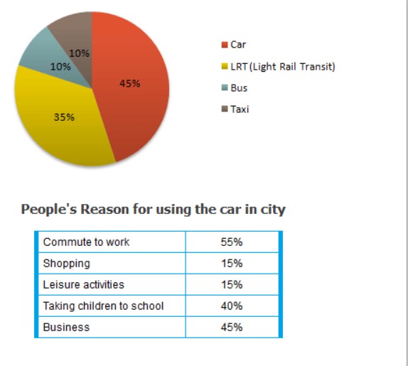
The pie chart and table chart illustrates the information regarding the Edmonton city people use the four different types of vehicle. The data has been calibrated in percentile.
Looking at the overall perspective, it is apparent that the majority of people used car for work whereas, they gave less preference to taxi as compared to other.
Apparently, it is crystal noticeable that the number of people who were using by Bus and taxi which remained same. Then they gave more preference to a car. Apart from it, the proportion of those who are using the light rail transit and Bus which was more than one third and less than one-fifth orderly. After, the percentage of use taxi for shopping was least which approximately one-tenth.
Turning towards the remaining data, the percentage of the car was higher rather than others vehicles. After that 15%of people who need to use the taxi for leisure activities—furthermore, they using the Light rail transit for taking children to school.
Follow Us on IELTSFever Twitter for more updates
Discover more from IELTS Fever
Subscribe to get the latest posts sent to your email.