The graph below shows the amount of UK investments in clean energy from 2008 to 2015. Summarise the information by selecting and reporting the main features, and make comparisons where relevant.
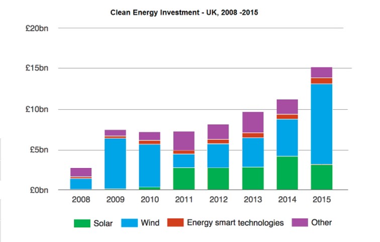
The yielded bar charts illustrate different types of four clean energy investments in the UK between 2008 and 2015.
Overall, it can be clearly seen that year by year investment proportion was rose—additionally, the least invested in energy-smart technology and the highest in the wind.
For Wind, 2 billion pounds was invested in this source which grew rapidly after a year. It was £6bn till 2010 although, later it dropped and from 2010 to 2015 investment goes on an upward trend from £1.7 bn to £10bn. For solar, in the starting couple of years, clean investment was not invested in this source. In 2010 it had minor pounds while later it was almost the same for four years except in 2014 where it was £1bn more, which was also zenith.
For others, £1bn money was invested in 2008, which after a fluctuation in 2014 was £1.4bn, and after a year, it declined and had on account of £1.2bn. For energy smart technology, this energy source got only £0.2bn in 2008 which was the lowest investment it climbed slightly, after 7 years investment was only £0.5bn with only 0.3 billion pound increase.
Follow Us on IELTSFever Instagram for more updates and the latest test tasks.
Also Read The Charts Below Show The Results of A Survey of Adult Education
Discover more from IELTS Fever
Subscribe to get the latest posts sent to your email.