


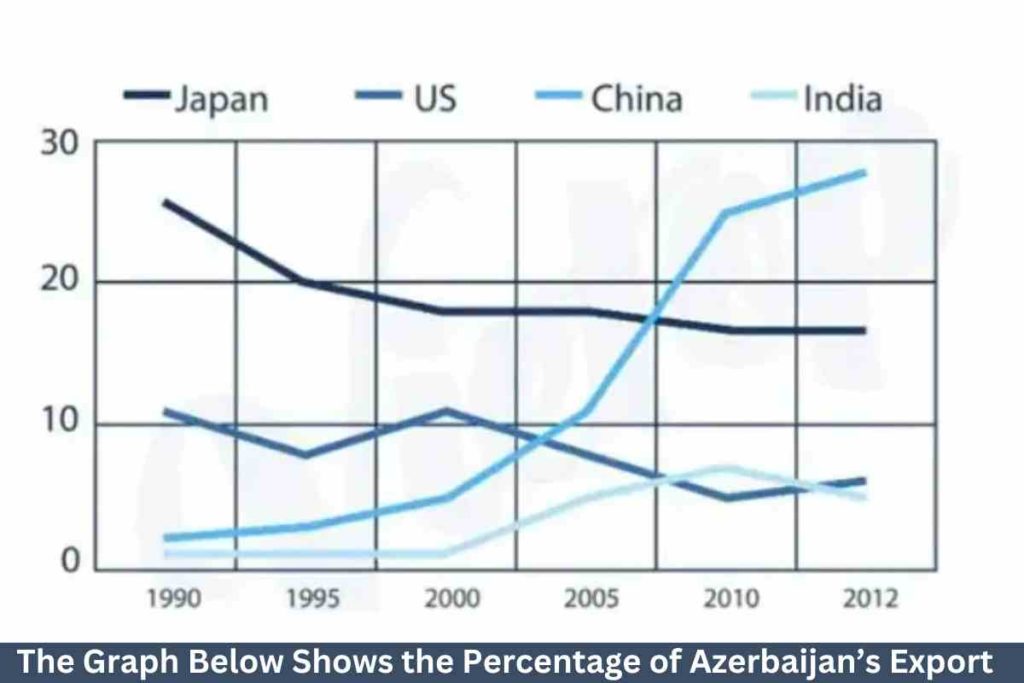


The chart illustrates the percentages of Azerbaijan’s exports to Japan, the US, China, and India over 22 years from 1990 to 2012.
Overall, it can be seen that Japan received most of Azerbaijan’s exports while India got the least over the period.
To commence, despite Japan being the country that received the most exports from Azerbaijan, it also decreased over the entire period. In 1990 Japan had about 27% of Azerbaijan’s export; it then declined to 20% in 1995 and continuously dropped steadily to 17% in 2012, becoming the second highest country to receive Azerbaijan’s exports in 2010 and 2012.
Again, China was the second highest nation which to Azerbaijan sends its resources, and its trend increased massively over the period. In 1990, China had 2% of Azerbaijan’s exports, and China’s percentage inclined steadily to 5% in 2000. It then continuously surged significantly to 25% and 28% in 2010 and 2012, becoming the most preferred destination for Azerbaijan’s exports in 2010 2012.
Moreover, the US was the third-placed nation that in Azerbaijan transports its goods, and its trend decreased over the period. It started at 11% in 1990 and fluctuated in the first ten years as well as declined to about 5% in 2010, becoming the country to receive the least Azerbaijan’s exports and then increased to 6% in 2012.
Lastly, India is the least country that had Azerbaijan’s exports, but its trend increased over the 22-year period. India had only 1% of Azerbaijan’s exports from 1990 to 2000 and increased significantly in the next decade to approximately 7%, becoming the third choice of nation for Azerbaijan’s exports in 2010 and finally declined to 5% in 2012.
![]()

Sample 2:-The Graph Below Shows the Percentage of Azerbaijan’s Export
The line chart illustrates information about Azerbaijan’s transport to Japan, the US, China, and India between 1990 and 2012. The data has been calibrated in percentages.
Overall, the most noticeable thing is that exports to China increased while exports to Japan decreased throughout the given time period.
At first glance, export was around 27% in Japan in 1990, which continuously decreased to about 19% in 2000. Between 2000 and 2005, it remained stable, then declined again for the next five years, and after that, it remained constant for the next two years. Moreover, in the US, exports fluctuated between 11% in 1990 and nearly 7% in 2012.
Furthermore, in 1990, the rate of transport in China stood at around 2%, and it rose gradually from 1990 to 2005, then drastically improved over the next five years. Finally, in 1990, India was the only country that imported the least, around 1%, and that remained unchanged for the first ten years. After 2000, it started to increase and reached nearly 10% in 2010, then reduced slightly in the next two years.