The Graph Below Shows the Production Levels of The Main Kinds of Fuel in the UK between 1981 and 2000. Summarise the Formation by Selecting and Reporting the Main Features and Making Comparisons Where Relevant.
 Sample Answer: The Graph Below Shows the Production Levels of The Main Kinds of Fuel in the UK between 1981 and 2000.
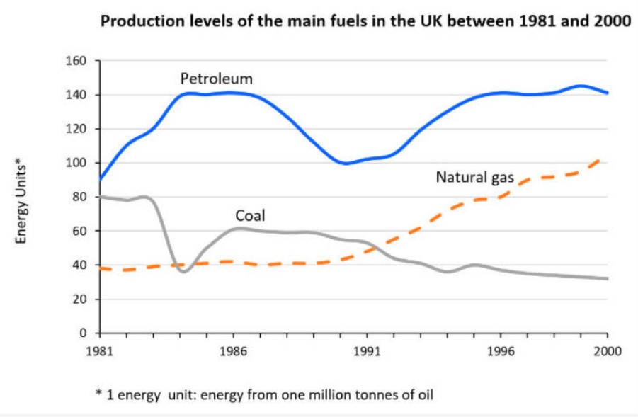
The line graph compares the production of three different kinds of fuel used in the UK between 1981 and 2000.
It is clear that petroleum production has been steady over the period shown, whereas coal production has been slowly declining. Production of natural gas has increased significantly since 1981.
In 1981, petroleum production was about 90 energy units. Production of coal and natural gas was lower, at around 80 and 40 energy units, respectively. By 1991, production of natural gas and coal was similar, at around 50 energy units, with natural gas production overtaking coal in the coming years.
By 2000, petroleum remained the leading fuel source. About 140 energy units of petroleum were produced, compared with about 100 energy units of natural gas and only 30 energy units of coal.
Follow us on IELTSFever Facebook Page for more updates and latest News about Immigration.
Discover more from IELTS Fever
Subscribe to get the latest posts sent to your email.