The graph below shows the quantities of goods transported in the UK between 1974 and 2002 by four different modes of transport. Summarise the information by selecting and reporting the main features, and make comparisons where relevant.
Sample Answer of The Graph Below Shows the Quantities of Goods Transported
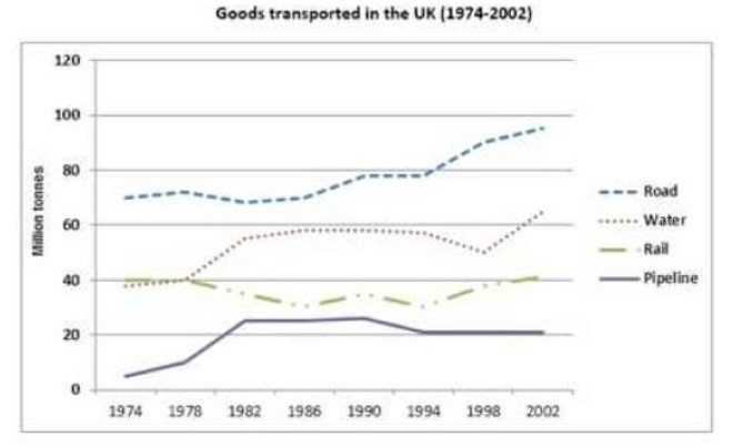
The provided line charts demonstrate the four different transportation modes, rail, road, water and pipeline quality in the UK from 1974 to 2002. Good transported was measured in million tonnes.
Overall, road transportation and water transportation carried more quantity of goods in the UK than the amount carried by pipelines and rails.
In 1974, 40 million tonnes transported by water and rail that remains same for 4 years while with the highest 70 million tonnes road transportation mode on top. After 1978 water mode was increased roughly 19 million tonnes and remain constant tones for 12 years, after dramatical fluctuation it touched its peak point at 62 million tonnes in 2002. However, after the same demand for 4 years, rail
transport was drop slightly and in 1986 had 30 million tonnes, after slow fluctuation it had the same
million tonnes in 2002 as in starting year. Moreover, transport via road is the main mode, its growth
dramatically, between 1990 to 1994 had 80 million tonnes and had more 22 million tonnes in 2002 than 1974.
People less prefer pipeline in starting phase hence, only 1 million tonnes was in 1974, which rose moderately and in 1982 it was 21 million tonnes, for a decade data remained consistent and fall only 1 million tonnes in 1994 and remained same for a further period.
Discover more from IELTS Fever
Subscribe to get the latest posts sent to your email.