The graph describes the changes in Medical Funding in four countries from 2010 to 2018. Summarise the information by selecting and reporting the main features, and make comparisons where relevant.
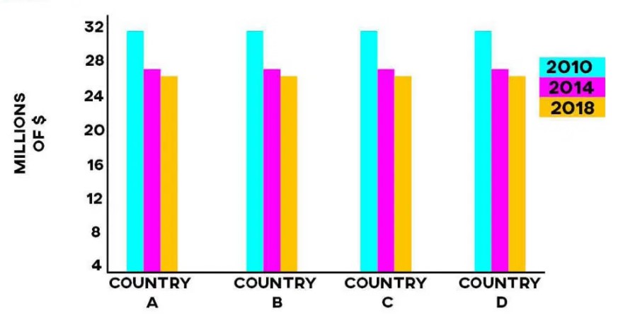
The yielded bar charts illustrate four different countries medical funding changes between 2010 and 2018; the funding measurements unit was millions of dollars.
Overall, it can be clearly seen that distributing medical resources or funds declined year by year, not only for one particular nation but all four.
For country A, roughly 31 million dollars funding was in 2010, which dropped $5 million after four years. In 2018, it was 26 million dollars. For country B, in 2010 had the same amount of fund money as country A distributed in the same year. Later it went on a downward trend, and after eight years, it was 25.2 million dollars.
For country C, the medical field got the highest amount of money in 2010 at $31.2 million. After shrinking 4.2 million dollars in 2014, it continued and in 2018 fund was 25.6 million dollars. For country D, in the starting years, $31.7 million was the funding for the health department which decreased year by year and in 2014 and 2018 had identical funding as country B had in both years.
Follow Us on IELTSFever Instagram for more updates and the latest test tasks.
Also, Read Writing Task 2( example 31) computers to be more of a hindrance than a help.
Discover more from IELTS Fever
Subscribe to get the latest posts sent to your email.